How to Design Banner Ads That Drive Traffic

In the online world of advertising, banner ads have proven to be profitable for small and large businesses alike. These ads are the ones occupying space on the top, sides, or bottom of the web pages you frequent. Whether they like it or not, the average person sees around 1,700 banner ads per month while browsing the internet – that’s almost 243 ads per week.
There are multiple benefits to creating banner ads for your small business. First off, they cost considerably less than a print or billboard ad. Secondly, they increase your brand awareness. Thirdly, when people agree to cookies when they enter a website, they opt-in for their data to be collected for advertisers. This means that you are able to target your banner ads to the right kind of audience. This also means that you are able to get a considerable amount of data from these banner ads throughout the duration of the campaign.
So how do you design a banner ad that catches the attention of your intended audience without them ignoring it, thinking it’s annoying, or choosing not to click because they think it’s spam? The short answer: you’ve got to be intentional about your design and make it clever enough that someone wants to click on it.

If you’re wondering how much it costs to create a banner ad, the pricing varies. With BeFunky’s Graphic Designer and banner ad templates, you can use high-quality, pre-designed banner ad templates made by professional graphic designers. All you have to do is customize the information on the banner ad and you can design a very cheap banner ad in minutes. First, let’s go over the top five tips for designing banner ads and then you can follow along in order to design your own.
5 Tips for Designing Banner Ads That Convert
When designing a banner ad, the first thing to do is determine your marketing objective. Do you want people to know you’re having a sale? Are you trying to sell a specific product? Are you trying to create brand awareness? Remember, you only have a few seconds to catch the attention of your audience and five more seconds to hook them with your message to get more customers. Here are our best tips for designing ads that convert:
1. Use High-Quality Photos
It may sound like a no-brainer, but if your ad contains low-quality imagery, chances are, it won’t get clicked. Just like with social media, banner ads can be your first impression to more customers. You want to present your brand with your best foot forward.
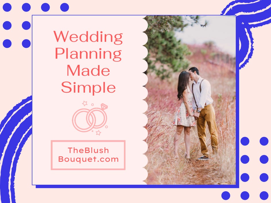
Make sure you ask for the specs of your banner ad and make sure that your imagery has the same width as the banner ad. This will usually be in pixels (px). If your image file size is smaller than the required ad space size, it’ll get stretched and distorted.
BeFunky’s banner ad templates are perfectly sized for a variety of banner ad requirements, meaning you’ll know exactly how your images will look as you’re designing. Aim to use an image that best represents your goal, is eye-catching, and not too busy or cluttered.
2. Keep the Copy Short and Readable
Since you only have a short amount of time to catch your audience’s attention, plan on simplifying your copy with a clear value proposition or Call to Action. You’ll want them to quickly understand what your ad is about, that it’s coming from your company, and what benefit they’ll have by clicking on it.

Aim to use no more than five to seven words in your entire ad. People like to skim web pages quickly and unless the first few words stand out to them, they will keep scrolling past all your efforts.
Also, make sure your fonts are clear and not decorative. A simple sans-serif font is best but can look good if paired with a serif font. Check out The Ultimate Guide to Font Pairing if you need help.
3. Keep It On Brand
If you have clearly defined brand colors, one way to increase brand awareness and build trust is to incorporate them into all of your marketing efforts, banner ads included. This makes your entire branding palette cohesive, thus helping consumers recognize your business.
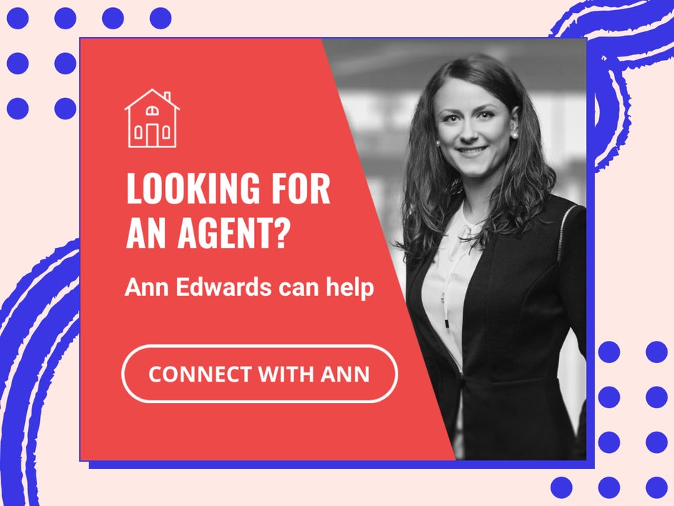
Additionally, be sure to include your logo and other important elements of your brand. Brand consistency is why Nike always incorporates the same fonts, signature colors, and swoosh in all that they do. Aim to do the same with your own brand, even if you’re currently at a smaller stage than Nike.
To say this, sometimes you don’t need to stay on brand in all areas. It is important to stick with your same logo across the board, but it is okay to change up your colors for social media and advertising if it helps to communicate your message better. If you are designing a banner ad for a specific holiday or season, you may want to change up your color palette for this – in this case, it is okay to veer off the path a little bit.
4. Incorporate a Clear Call-to-Action
Your call to action button is your final instruction to the consumer. The clearer your message, the better. Use strong, clear CTAs like “Learn More,” “Shop Now,” and “Limited Time Offer.”
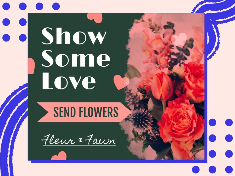
Make this CTA a button that looks clickable. Your banner ad will be clickable on any part of the image, but having a button will do some psychological benefit to your potential customers, giving you a higher chance that they will click through to your provided link.
5. Assign the Click-Through Carefully
You must make your banner ad click-through to a landing page or hero image that is consistent with the ad. You do not want to create an ad that attracts a customer and then they get lost once they click on it. All your efforts will be for nothing. Set them up well and direct them to the correct place that corresponds to the ad. Check out this article about How Creating a Simple Sales Funnel Will Amplify Your Sales.

Standard Banner Ad Sizing and the Benefits of Each
Website ad space can be likened to real estate. The bigger the ad and more prominent the ad space, the more expensive the ad will be. Lucky for you and your marketing budget, BeFunky’s Graphic Designer has four different types of banner ad templates to choose from, including Skyscrapers, Leaderboards, Medium Rectangles, and Large Rectangles.
Option 1: Skyscrapers
Likened to a large, multi-level condo in the city, skyscrapers are the best piece of real estate money can buy. They are prominent, eye-catching, and in terms of banner ads, scrollable.
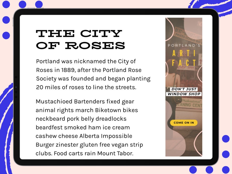
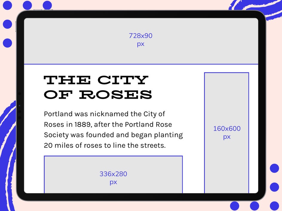
This 160x600 px ad is long and follows the page on scroll, so you have a longer chance of catching someone’s attention before they scroll past it. These ads often yield a 13% impression share.
Option 2: Leaderboards
These are 728x90 px ads that you’ll see at the top of a webpage or blog, above the content. They’re usually the first part of a page that an internet user sees, and they yield 32% of impressions.
Option 3: Medium Rectangles
These 300x250 px ads tend to be the most available size for advertisers and, surprisingly, yield the most impressions (33%). They’re found on the sides of a webpage or blog as the reader is scrolling the page, which makes for a non-obtrusive ad experience for the consumer.
These are a favorite of mine and are also the best ad space if you want your banner ad to be a GIF. GIFs are a great way to Maximize Ad Space. If you want to learn how to make a web banner GIF, follow this tutorial.
Option 4: Large Rectangles
These 336x280 px ads are often embedded within an article. They yield a much smaller impression share at just 1%, so it’s very important to place these within articles on websites and blogs that get a high amount of traffic. I often see these a lot in the middle of an article or online magazine.
How to Quickly Design a High-Quality Banner Ad
Now that you know your goal, the essential web banner design tips, and you’ve determined which ad placement is right for your business, it’s time to show you how to design a banner ad with BeFunky’s Graphic Designer.
Step 1: Choose a Banner Template
To get started, select Open at the top of the screen and then select Templates. Select the Online Advertising drop-down and choose the standard banner ad sizing layout you want from the options above.
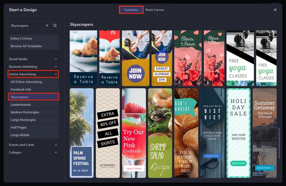
From here, click on the template you want and then select Use This Template.
Step 2: Customize the Text
Customize the copy on your ad to reflect your own message. Double-click on any textbox within the template. This will allow you to type a new message.

With the text box selected, you can change things like the Font, Size, Color, and Alignment in the Text Properties menu that appears. You can reposition the text boxes by clicking and dragging them around your canvas, or resize and rotate the text using the circles around the textbox. Remember to keep your copy brief - five to seven words max!
Step 3: Change Your Banner Ad Imagery
Replace the current image with a high-quality photo of your choice. Whether you’re looking to use a free stock photo in your banner ad design or you want to use one from your own files, click on the Image Manager tab in the left-hand menu.
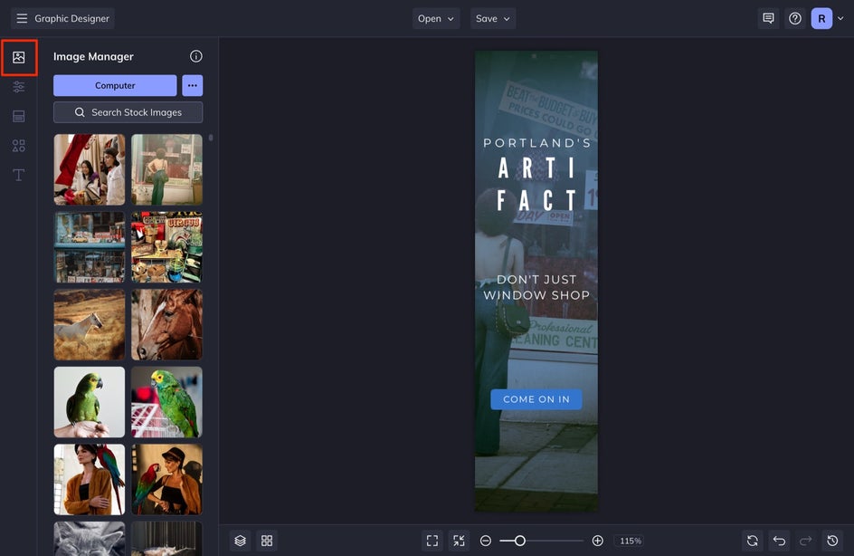
Once there, you can click the Computer button to search your files or the Search Stock Images button to search over a million free stock photos to use in your design, right from the Graphic Designer.
If you want to make any additional edits to your image, such as adding a Tint or editing your photo in our Photo Editor, select the image. With the image selected, use the Image Properties menu that appears to change the Color Overlay, Blend Mode, Opacity, and more.
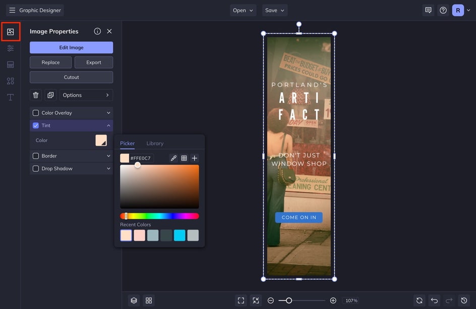
Clicking Edit Image will allow you to access every single effect and tool available in BeFunky’s Photo Editor, without leaving the Graphic Designer.

Once you’re done editing, you can select Done Editing Image to return back to your project in Graphic Designer without losing your photo edits. This is one of my favorite BeFunky features.
Step 4: Choose Design Elements
Be sure to add your call to action button for the best impression results. If your template doesn’t have one already added to it, select the Graphics tab in the left-hand menu. Select the Rectangle to add it to your canvas and size it properly by clicking and dragging the corners towards the center of the rectangle.
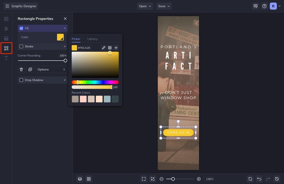
Once sized, with the rectangle selected, adjust the Corner Rounding in the Rectangle Properties menu that appears. Adjust the color by selecting the Fill option and choosing a new color swatch.
You can also search through hundreds of our other graphics to add to your banner ad. Keep it simple.
You may also find that you need to adjust some things at the end like making certain text bold or changing certain colors. This is okay and part of the design process. Just head back to the previous steps in order to make these adjustments if you need help.
Step 5: Save Your Banner Ad
When you’re satisfied with your banner ad design and ready to start using it, click the Save button at the top of the canvas. Select Computer to save it to your computer. For online web advertising, I like to save my file as a JPEG or PNG file. Ask the website host for the preferred file method, they should have included this in the specs they gave you.
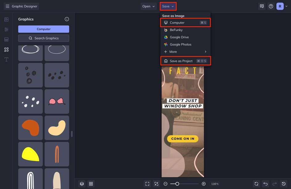
You can also choose the Save as Project option to save your ad in an editable format, just in case you want to come back to it later to make changes. I always choose this option for my designs, because I don’t want to have to design the entire thing again if there is a typo or issue. Save your projects!
Designing Banner Ads for High Click-Throughs
No matter what your advertising goals may be, BeFunky’s Graphic Designer makes it super easy to create an affordable ad for your business advertising. Get ready to watch those click-through rates soar and learn all you can about your target market as the impressions increase.
