How to Develop Your Brand Photography for Stronger Marketing
When speaking about branding for your personal aesthetic or business, there is a subject that often gets completely overlooked: brand photography. Brand photography is so valuable to a brand but often gets overlooked because there are so many other aspects of branding that people focus on like logos, color palettes, and typefaces. If you’ve already developed these, it is time to focus on your brand photography – and before you get overwhelmed, we are going to lay out everything you need to consider when choosing your brand photography strategy and aesthetic.
This is one of the easiest things that you can do that will bring cohesivity and elevate the brand you’ve already built. The great thing is, you can use BeFunky’s Photo Editor to edit all of your brand photography moving forward.
2 Things You Can Do to Immediately Elevate Your Brand Photography
Typically, photography gets entirely missed in branding discussions. This is a shame because it is one of the easiest things to develop, doesn’t take a lot of time, and also can shift your brand so quickly!
1. Develop a Photography Aesthetic Based on Strategy
Most people don’t discuss strategy when the topic of photography comes up – if it even does come up. When developing a strategy, first take a look at the chart below and place a marker on the scale that best represents your brand. Try to avoid placing the marker directly in the middle of the spectrum.
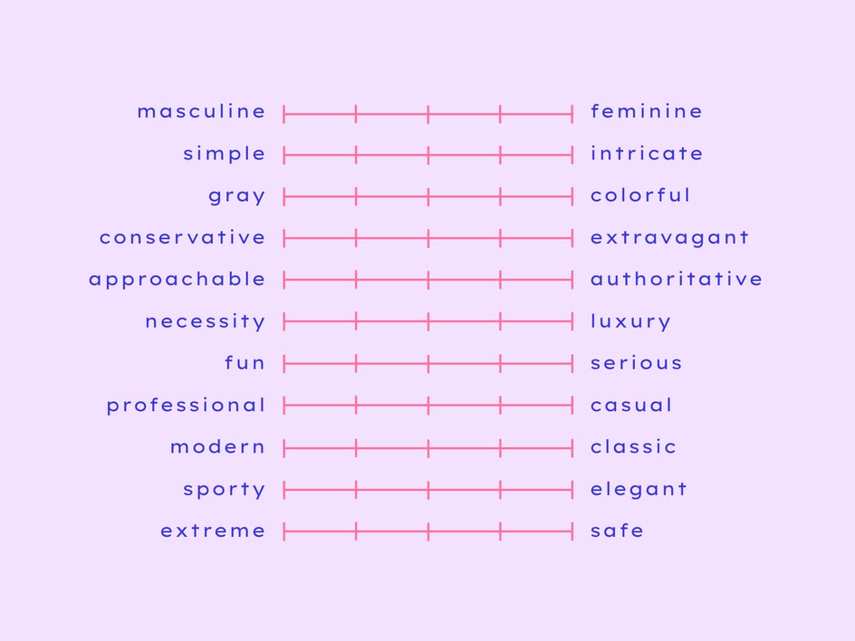
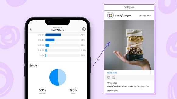
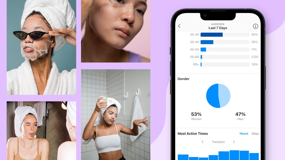
Once you place your marker on each of the spectrums above, you will have a good base for where to start with your visual strategy. Once you see a clear indicator it is time to ask yourself some questions. Do you have a main age and gender demographic that you currently serve? Is there a demographic that you don’t have but want to? This will be included within your photography strategy and will influence your aesthetic in the next section. As a note, if you have data to back any of this up, take some time to collect it and write it down. You can do this by going into your social analytics and even your website or purchasing analytics. If you want more help with looking at your social analytics, take a look at this article.
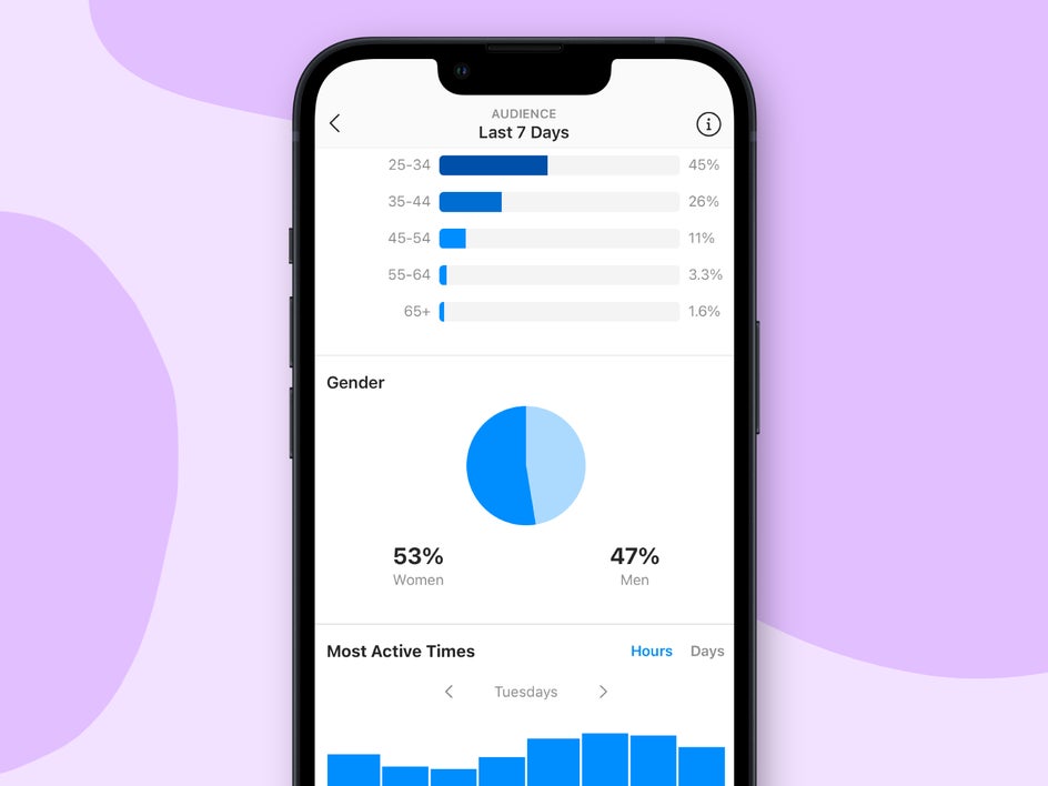
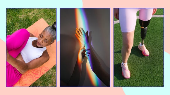
The other great thing about photography is that if you want to reach a certain demographic that you haven’t been able to get in the past, all you have to do is make some minor adjustments to your strategy and then start including that demographic within your photography campaigns. I did this with a wellness brand that wanted to reach an older demographic. People need to see a representation of their age, gender, or race within your photography in order to relate to it. If you are a wellness brand that is only showcasing pictures of 30-somethings, it will be more difficult for an elderly person to relate to the brand or feel like it is something that is for them.
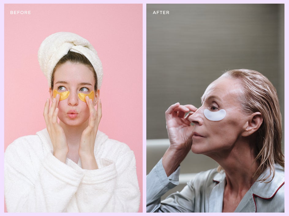
We ended up doing a photography campaign with people over 65 and it performed really well for them and is now one of their main demographics and customer base. Don’t underestimate the power of representation in your photography – it really can be a game changer.
Based on the answers to the spectrum above, you are now going to develop the visual aesthetic for your brand. There are so many different types and styles of photos that you can choose from. Do you like the kind of duotone photography that Spotify made popular? What about the kind of bright and playful photos that Youthforia developed?
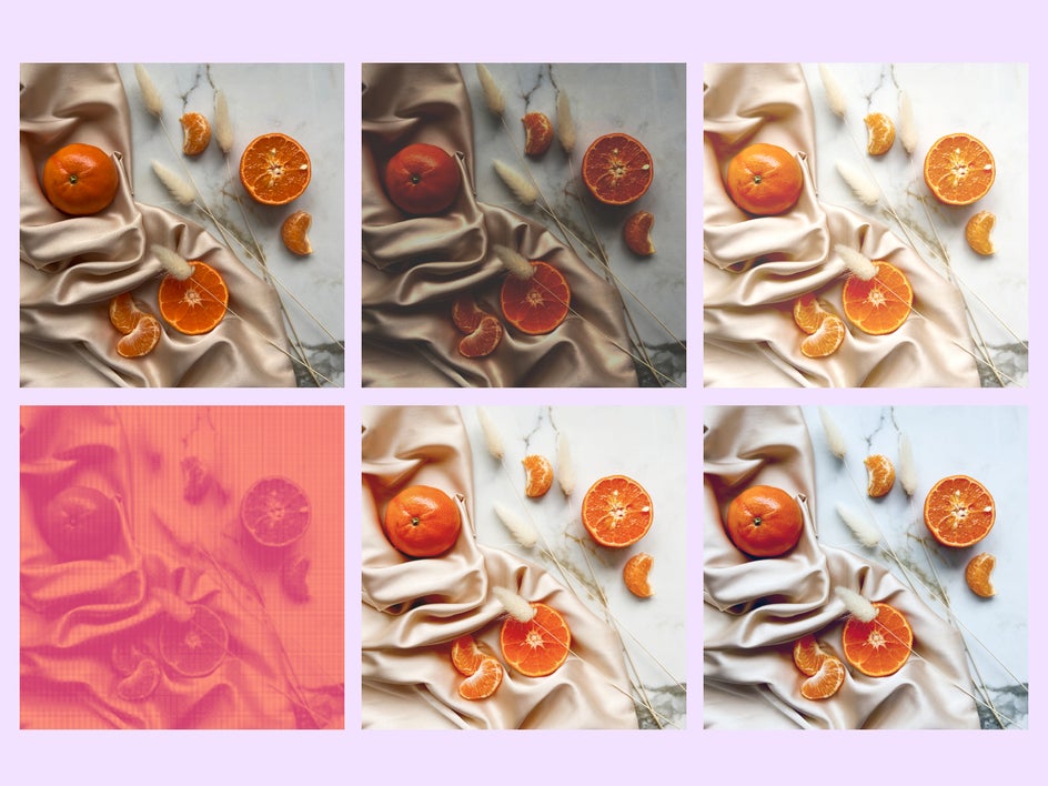
Developing a brand aesthetic is hugely important, especially if you are on social media. A consistent aesthetic can really do a lot for your brand recognition online. If you have a strong enough aesthetic, this alone can be a huge marketing advantage to you. Take a look at how applying a different aesthetic to the same image can significantly affect the image and it’s messaging! Do you want it to be bright and contrasted? How about dark and matte and moody? What about cool-toned or warm-toned? Earthtone?
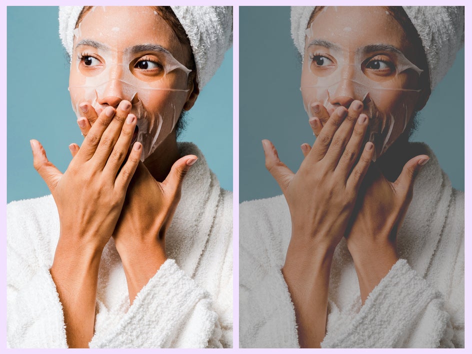
As an example, if your demographic is teen girls, you need to ask yourself if there is a visual aesthetic they like compared to another. Do some research about your demographic, including looking at other competitors within your niche or age demographic. You will notice in your research that current teens typically like clean images with vibrant pops of color and people candidly laughing or posing with attitude. On the other hand, if you are developing a skincare brand, choosing a sharp, clean aesthetic with harsh shadows seems to work well. You always want to make sure that your visual aesthetic matches your messaging. If you want your audience to feel the “clean-girl aesthetic”, you wouldn’t typically lean into the matte type of photography, you would typically do a minimalistic photo with harsher shadows.
If you need help developing an aesthetic, I always suggest making a mood board of the kinds of aesthetics you like or desire for your brand. This will be used as a guiding light for your brand aesthetic.
Once you develop your brand photography aesthetic, you can then apply this aesthetic to all of your photos. You can even batch-edit your photographs with BeFunky’s Photo Editor, which will make your editing process even faster and more efficient. It is important when doing a shoot that you are mindful of this aesthetic and stay on brand with your photoshoot and editing style. If you are working with a photographer, you should communicate both your demographic and aesthetic choices with them so they have a good baseline for where to begin.
2. Create a Library of Brand Photos
Trust me, this tip is going to save you so much time and energy. Have you noticed that when following a brand on social media, there are specific photos you can see them repeating on their Feeds? It might not be the same exact photo, but a similar photo of a product or person just from a different angle. These are typically brand photos and the great thing about brand photos is that they are reliable and great in a pinch.
There is a difference between a brand photoshoot, a product photoshoot, and a campaign photoshoot. A brand photoshoot should showcase your best-selling products and include your brand colors and brand photography aesthetic compared to a campaign where you can kind of go rogue with some experimentation.
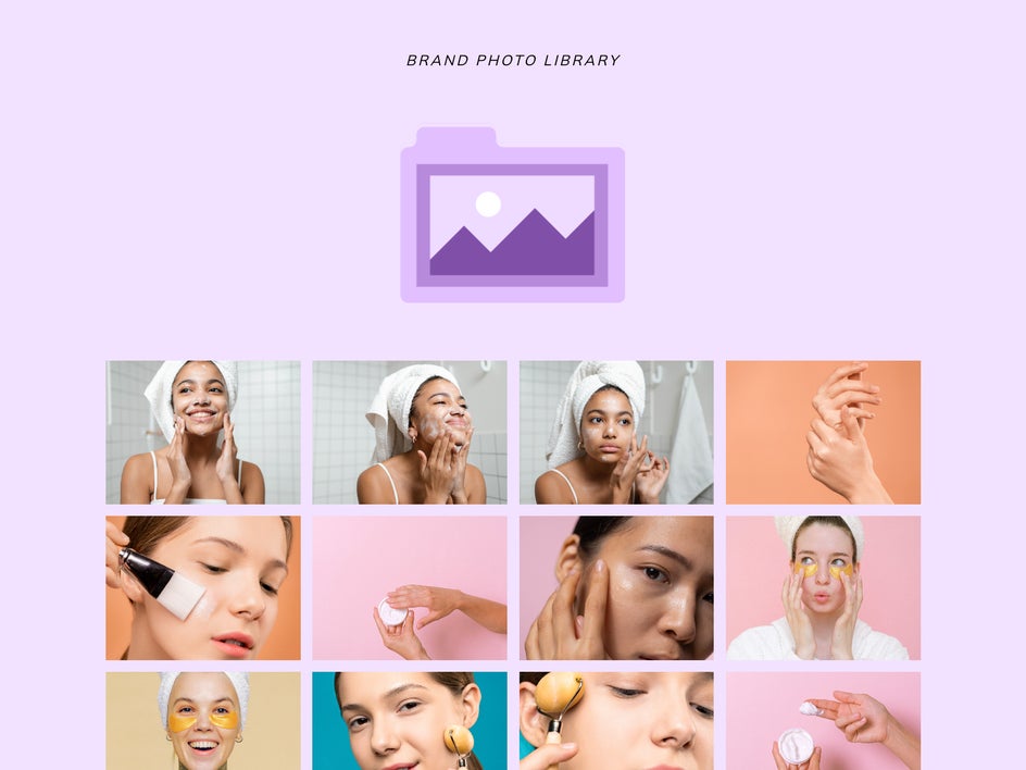
I usually do a yearly brand photoshoot that I keep a library of and use them as filler images when I need them in my Feed or for marketing purposes and am in a pinch. If you don’t want to do them yearly, you can generally usually use these brand photos for up to three years before updating them. As a rule of thumb, when developing brand photos, you would want them to be able to grow with your company for up to three years before having to redo them. That is a good marker for how a brand photo is different from a campaign photo.
A Walkthrough for a Mock Brand’s Photography Aesthetic
Taking the information above, we are going to create our brand’s photography aesthetic and then edit some of our brand photos.
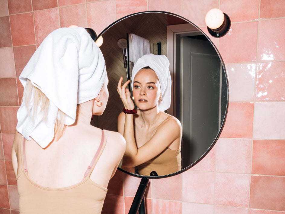
In doing the chart above, we wanted our brand to be more feminine, simple, colorful, extravagant, approachable, luxurious, fun, casual, modern, sporty, and safe. This gave us a great foundation for developing our demographic and the type of teens we wanted to represent within our photography.
Because we want our teens to be able to approach skincare from a safe place, we want our photos to feel professional (we will show this with our models’ poses, as well as a bright editing style), but also playful (we will show this with our models’ facial expressions as well as the colors used within our photoshoots). Take a look at this mock feed we made to get a better idea of our aesthetic.
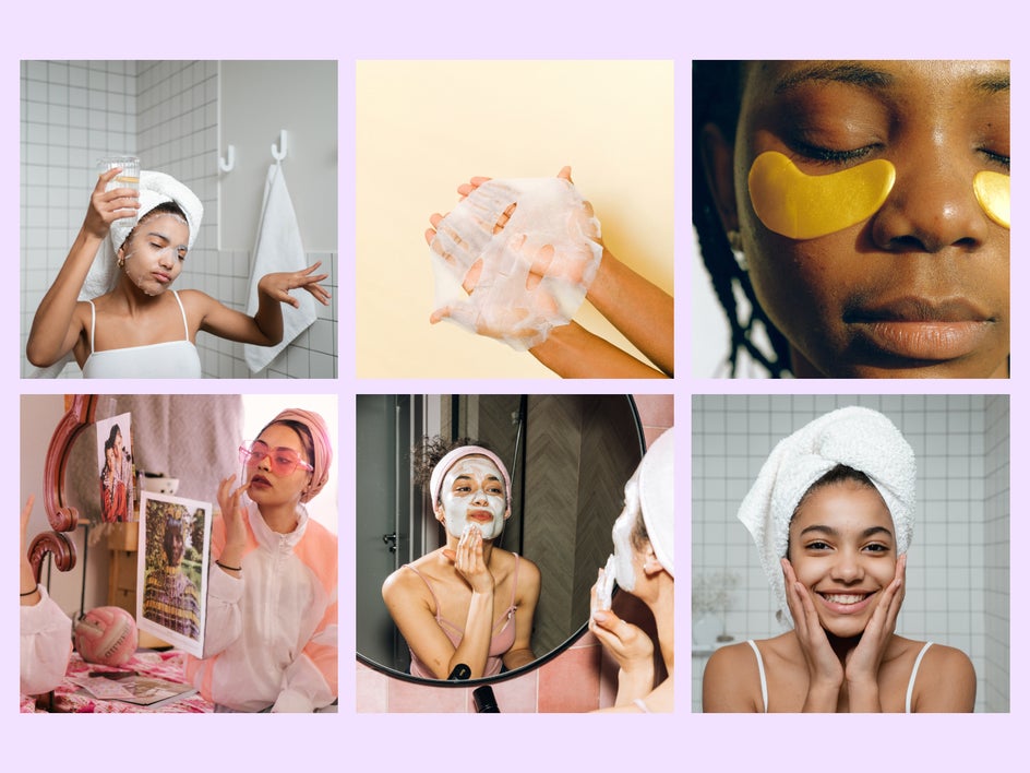
This is where strategy is fun because you create a balance with every choice you make and don’t always have to do straightforward options. When creating a teen brand, "professional" isn’t generally a word people use to describe a brand like this. We don’t want this skincare brand to be so playful that people don’t know if they can actually rely on the products, so we want the professionalism to be there to bring trust. We also don’t want it to be so professional that it is boring, so we will use color to balance this out.
Build Your Brand’s Photography Strategy and Aesthetic With BeFunky!
Take some time to go over the points above. When you are ready to start developing your visual aesthetic, BeFunky’s Photo Editor has everything you need to start creating the visual elements you need to represent your strategy.


