Crafting Connections: Expert Tips for Creating Exceptional Business Cards Online
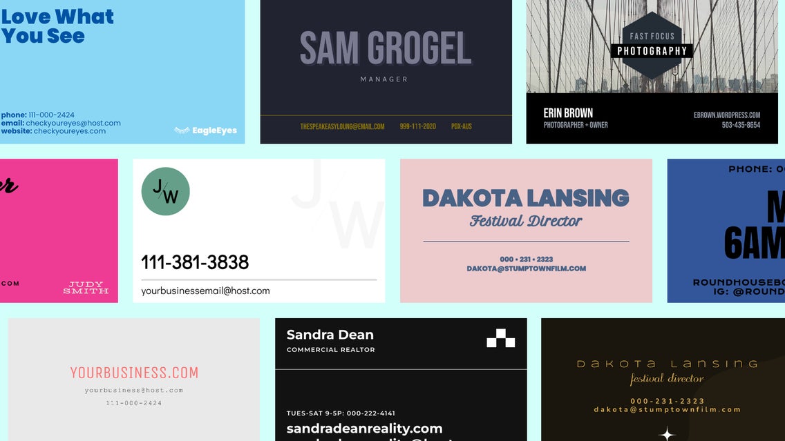
In today's digital age, where virtual connections often dominate, a business card remains an enduring symbol of personal networking. There is an art and science behind creating business cards that transcend the ordinary, forging genuine connections in a sea of exchanges. These small but mighty cards can wield significant power as gateways to professional relationships.
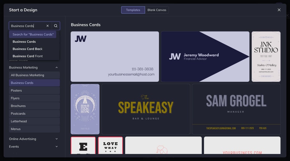
Understanding the subtle cues that influence perception and interaction can inform your design choices and maximize the impact of your business card. We have curated our favorite business card tips so that you can create your own cards in minutes. Whether you're a seasoned entrepreneur or a budding professional, mastering the nuances of business card design can elevate your networking game and leave a lasting impression on those you meet. Once you learn all the tips and tricks, you can create your stunning business cards with BeFunky’s business card templates!
How to Make Your Business Card Stand Out
Your card should make a memorable initial impact, represent your brand, and foster meaningful connections with these elements. Here's how to make it happen!
1. Use Clear and Concise Information
When it comes to including clear and concise information on your business card, simplicity is key. Start with the basics: your name should be prominent, followed by your job title and company name. Ensure that your contact details are easily accessible, including your phone number, email address, and website.

Remember, the goal is to provide enough information for potential contacts to reach you without overwhelming them with unnecessary details. By prioritizing essential information and maintaining simplicity in design, your business card becomes an effective communication tool that leaves a lasting impression.
2. Go With a Cohesive Design
A well-designed card communicates professionalism and leaves a lasting impression on those who receive it. You can choose from one of the many online business card templates that BeFunky has to make your business card look great. When selecting a design, consider how it aligns with your brand identity – from colors and fonts to the overall layout and aesthetic.
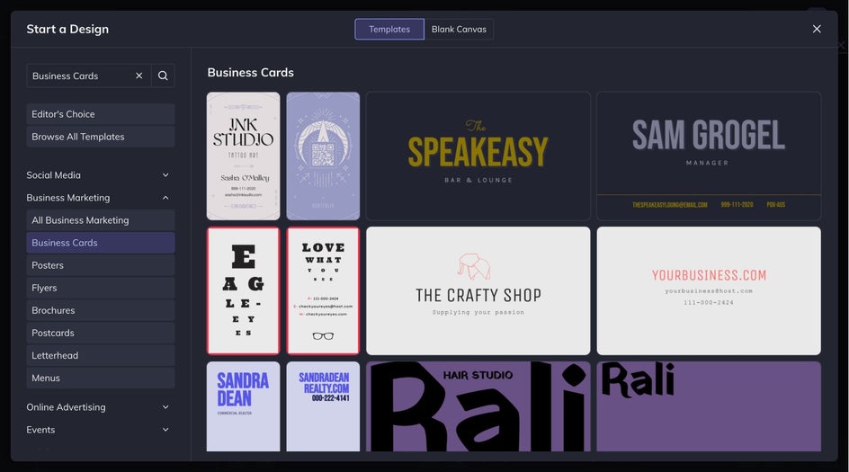
Clean lines and a cohesive design aesthetic convey attention to detail and a commitment to quality, while appropriate fonts ensure readability and consistency across your branding materials. By carefully crafting a design that reflects your brand values and personality, your business card becomes a powerful tool for making a positive and memorable impression in any networking situation.
3. Use Quality Materials for Printing
When choosing quality materials for your business card, you must make the right choice to make a lasting impression. Opting for high-quality cardstock and printing enhances the look and feel of your card but also reflects positively on your professionalism and attention to detail.
When printing business cards, it is important to remember that a sturdy card with a smooth finish exudes a sense of durability and reliability conveying to your recipients that you value quality in all aspects of your business. Investing in quality materials and a quality printer may require a slightly higher upfront cost, but the impression it leaves on recipients can pay dividends in the long run. A well-crafted business card made from premium materials makes a strong first impression and reinforces your brand's commitment to excellence and professionalism.
4. Add Unique Features
Incorporating unique features into your business card design can elevate it from ordinary to extraordinary, leaving a lasting impression on recipients. Features such as embossing, foil stamping, or die-cutting add a tactile and visual dimension that sets your card apart.
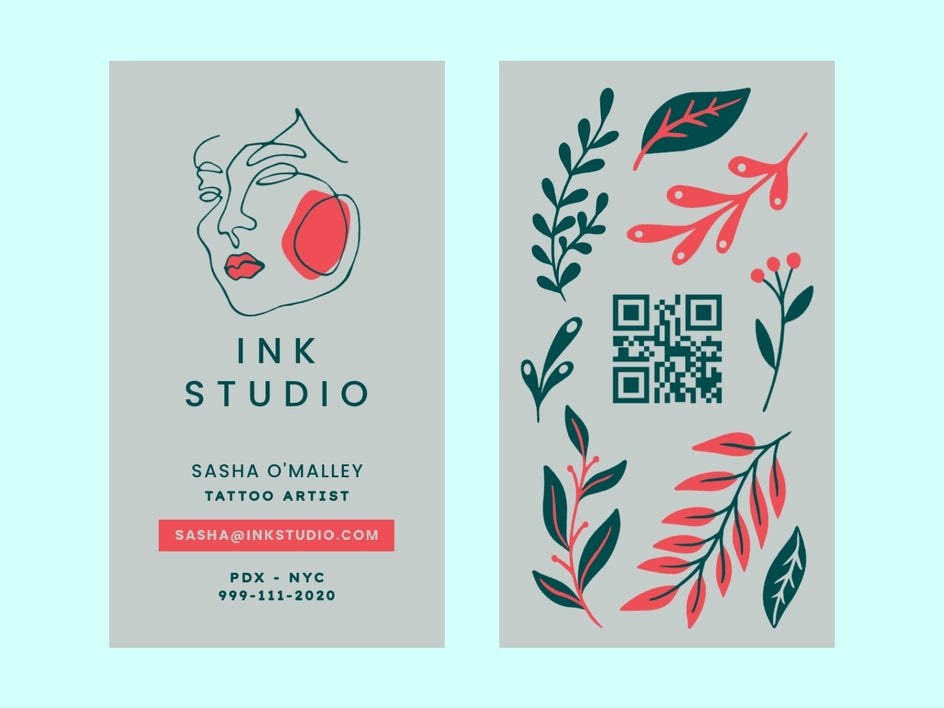
Embossing creates raised areas on the card surface, adding texture and depth, while foil stamping adds a touch of luxury and sophistication with metallic or glossy accents. Adding unique features like a space to write a note or a small QR code to scan to connect digitally can set you apart from the masses when you create your own business cards. Similarly, die-cutting allows you to create custom shapes or intricate patterns, making your card visually striking and memorable.
5. Think About Visual Appeal
Visual appeal is crucial in making your business card stand out and leave a lasting impression on recipients. Create business cards that incorporate visuals such as your logo, brand colors, or other key brand elements to help reinforce your brand identity and make your card visually memorable.
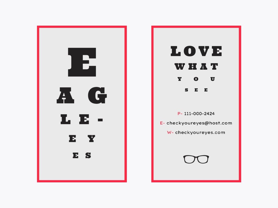
Your logo, in particular, is a powerful symbol of your brand and can instantly communicate who you are and what you represent. While visuals are important for grabbing attention, cluttering the card with too many graphics or information can detract from its effectiveness and readability. Instead, select a few key visuals that best represent your brand and convey your message effectively.
6. Stay Consistent
Consistency across all branding materials, including your business card, is essential for building a strong and cohesive brand identity. When your business card design aligns seamlessly with your website, letterheads, social media profiles, and other marketing materials, it creates a unified brand experience that reinforces your brand identity in the minds of your audience. Consistency in design elements such as color palette, typography, logo usage, and imagery helps establish visual continuity across different touchpoints.
This uniformity strengthens brand recognition and enhances brand credibility and professionalism. When recipients encounter your business card, they should instantly recognize it as belonging to your brand, thanks to consistent design elements. This recognition fosters trust and confidence in your brand, making it more likely for recipients to engage with you and remember your brand positively.
7. Add Some Whitespace
"Whitespace," or "negative space," is a fundamental element of effective design that is often overlooked. It's not just empty space; it serves a critical purpose in enhancing readability, organizing information, and creating visual balance on your business card. By resisting the temptation to overcrowd the card with excessive information or graphics, you allow each element to breathe and stand out.

Leaving ample whitespace around text and graphics helps prevent visual clutter, making it easier for recipients to process the information and navigate the card. Whitespace also plays a vital role in guiding the viewer's eye and directing their attention to the most important elements of your card. By strategically incorporating whitespace, you can create hierarchy and emphasis, highlighting key information such as your name or contact details while minimizing distractions.
8. Make Sure Your Card Is Functional
Functionality is a critical aspect of business card design that is often underestimated. While aesthetics are important, a visually appealing card must also serve its practical purpose effectively. When considering the functionality of your card, several key factors come into play. First and foremost, consider the physical dimensions of your card. A standard business card size is typically 3.5 x 2 inches, which fits neatly into most wallets, cardholders, and business card organizers. However, if you opt for non-standard dimensions, ensure that your card maintains practicality and convenience for recipients. Additionally, pay attention to the layout and typography to ensure readability. Choose a font size and style that is legible and easy to read, even at a glance. Avoid using overly decorative or ornate fonts that may sacrifice readability for aesthetics. Remember, the primary purpose of your card is to convey essential information clearly and efficiently.
9. Utilize a Double-Sided Design
Double-sided design offers a valuable opportunity to make the most of your business card's real estate. By utilizing both sides of the card, you can convey more information and enhance its functionality. On the front, prioritize essential contact details such as your name, job title, and company name, ensuring they remain the focal point. On the back of the card, consider including additional information that complements your brand or provides value to recipients.
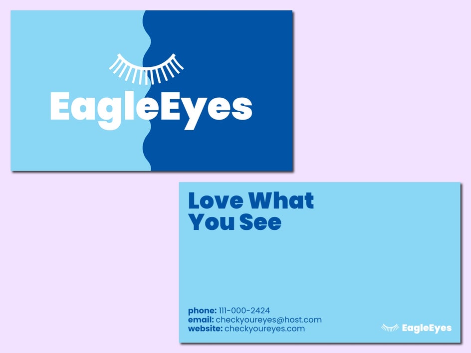
This could include a brief description of your services or specialties, a tagline that encapsulates your brand message, or a compelling call to action prompting recipients to visit your website or contact you for more information. Moreover, incorporating a QR code on the back of your card is an excellent way to bridge the gap between your offline and online presence. A QR code can direct recipients to your website, portfolio, LinkedIn profile, or any other online resource relevant to your business. This seamless integration of digital and physical channels enhances the user experience and encourages further engagement with your brand.
Create a Standout Business Card Design
Crafting an exceptional business card involves careful consideration of various elements, from design aesthetics to practical functionality. By implementing these tips and strategies, you can create a business card that captures attention, effectively communicates your brand identity, and facilitates meaningful connections.
Remember, clarity and simplicity are key when it comes to business card design. By following these expert tips and tricks, your business card can become a powerful tool for networking and leave a lasting impression on those you encounter in your professional journey. So, go ahead and unleash your creativity to craft a business card that truly reflects the essence of your brand and sets you apart in the competitive business landscape.


