How to Convey Emotion In Photos With The Color Tool

Color is a powerful tool in photography. When used right, it can help to create bold, beautiful photographs that make people stop and take notice. But color can do so much more than just make your images stand out. It can also help to convey emotions in pictures to take them to the next level.
When it comes to enhancing the color within your photos, however, you might be wondering where to start. Thankfully, BeFunky’s Photo Editor is home to our Color tool, which has everything you need to adjust your photo’s hue, saturation, and temperature.
Keep reading, because we’ll show you how to use color in photography to convey emotions!
How to Enhance the Color and Mood in Your Photography
Ready to try out the Color Tool for yourself? Head to the Photo Editor and open an image of your choice to get started.

Step 1: Navigate to the Color Tool
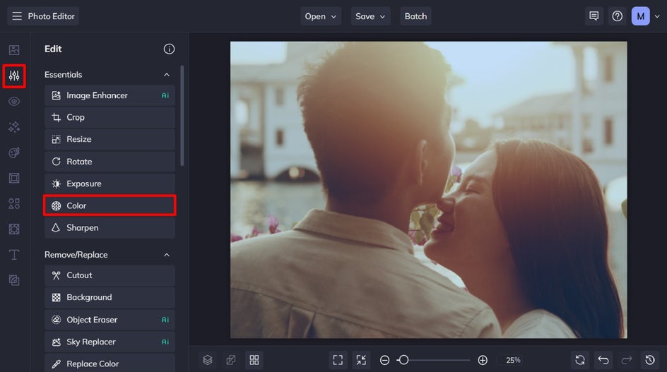
You’ll find the Color tool within the Edit tab, underneath Essentials.
Step 2: Adjust Your Photo’s Color
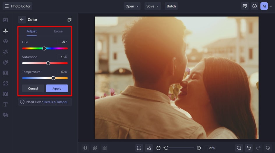
Within the Color tool, you have the option to adjust three elements of your photo: the hue, saturation, and temperature.
Hue is another word for color, so adjusting this slider will change the overall color of your image accordingly. Keep in mind that the Hue you select will look different when added to the colors already in your photo. It’s helpful to compare this adjustment to mixing paint colors together. Adding a blue hue to red in a photo, for example, will turn it a shade of purple.
Saturation, on the other hand, controls the intensity of color in your photograph. Finally, the Temperature slider adjusts how warm or cool the colors in your image are.
Once you’re happy with the color in your image, click Apply.
Step 3: Save Your Photo
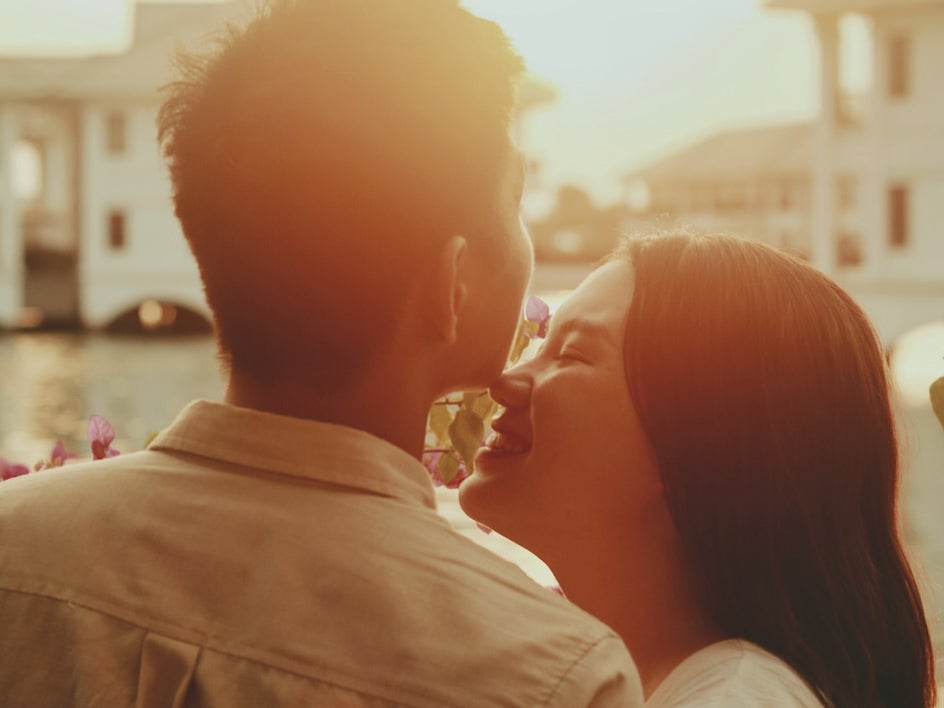
Once you’ve adjusted the color within your image, you can then apply any other edits you wish. For example, we also used the Image Enhancer tool at 25% strength to this image. Then, save your image by clicking Save at the top of the screen and selecting your desired save location.

Final Results: A Red-Toned Photo That Conveys Passion
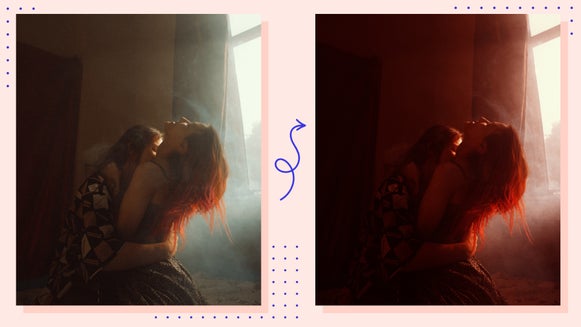
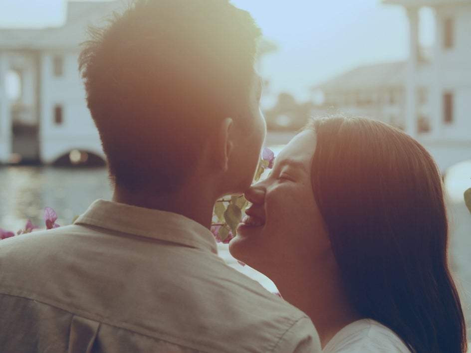
Using the Color tool, we turned this cool-toned photo lacking emotion into an image filled with warm red tones to convey love and passion. All it took was a few clicks!
What Do Colors Symbolize in Photography?
Now that you know how to change the color within your photo to convey emotion, you might be wondering exactly what colors convey what emotions. Photographers use colors to show a wide range of emotions. Here are the most common colors, as well as what they symbolize in photography.
Red Conveys Passion
The color red evokes feelings of warmth and love, as well as energy, excitement, passion, and anger. While its emotions vary from one extreme to another (like love and anger), the subject of the photo and their body language will be able to provide this important context. For example, in this image, the red background can be used to convey both the energy and excitement of rock music (as implied by the electric guitar), as well as the subject’s passion for music.

Blue Is Calming and Soothing
Blue is a calming color that can be used to create serenity in your images by making them appear cool, tranquil, and soothing. This is because the color blue is often associated with water, clear skies, and fresh air, as you can see in the photo below.

Yellow Evokes Happiness and Optimism
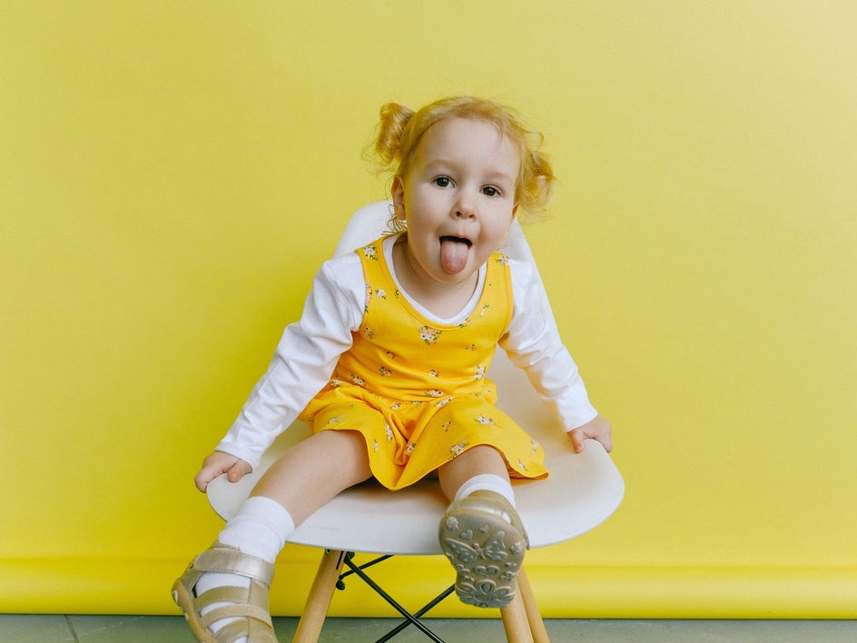
Yellow has long been associated with joy, happiness, laughter, and cheerfulness because it symbolizes the sun - something we all crave when we're feeling low. It’s an optimistic and uplifting color that has a sense of playfulness, making it a common color in photographs conveying the summertime, as well as children playing.
Black Conveys Somberness
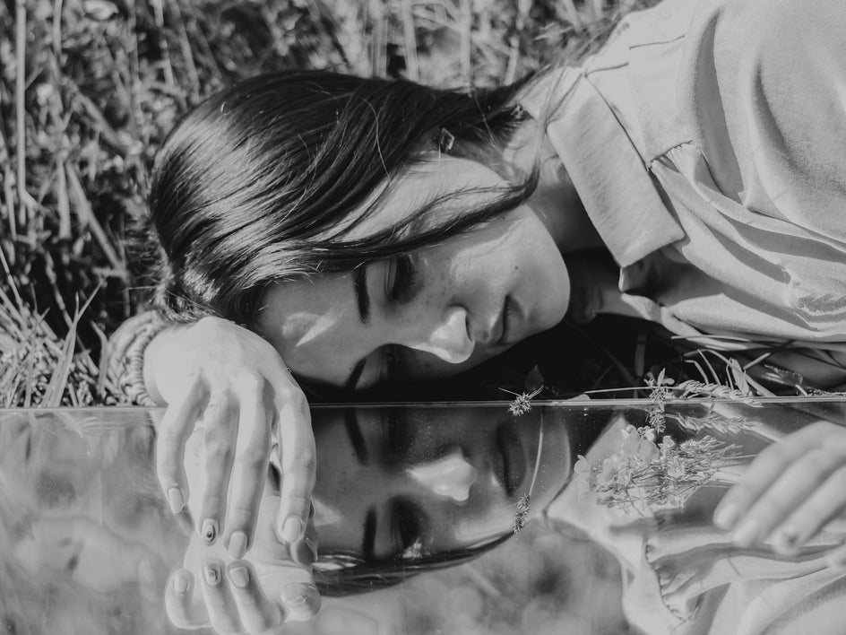
Black is a powerful and dramatic color that evokes feelings of mystery, elegance, and sophistication. It’s also the color of mourning and grief, which makes it a great choice when you want to convey somberness or sadness – much like in this image below.
Green Is Peaceful and Harmonious
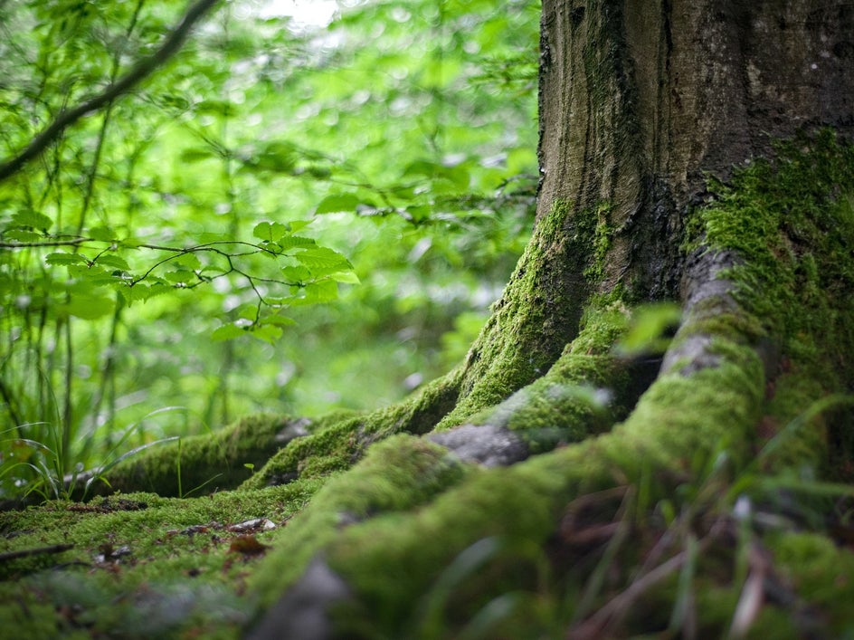
Green is a color that symbolizes nature, growth, and harmony. It's the color of plants and leaves, but it also represents springtime and new beginnings. It's also associated with the environment, particularly when it takes on a darker hue like the aptly-named “forest green”.
Green is said to be the most restful color for the human eye because it contains both yellow and blue hues.
Embrace Color and Mood in Photography With BeFunky
In the end, it's all about finding a balance between color and emotion. You want to use color as a way to enhance your photo, not dominate it. The key is in knowing which colors work best with which emotions and then pairing them appropriately with your subject matter.
Take your images to the next level by altering their hue, saturation, or temperature within our Color tool. Head to the Photo Editor to test out the Color tool for yourself!


