Who Knew that Blue Could Look So Good? Cyanotype Prints
Every once in a while I look at B&W photographs and get drawn in solely by the tonal qualities of the monochromatic image. Since we don't see in B&W in our everyday reality, this is inherently an abstract -- and therefore -- artistic form of expression.
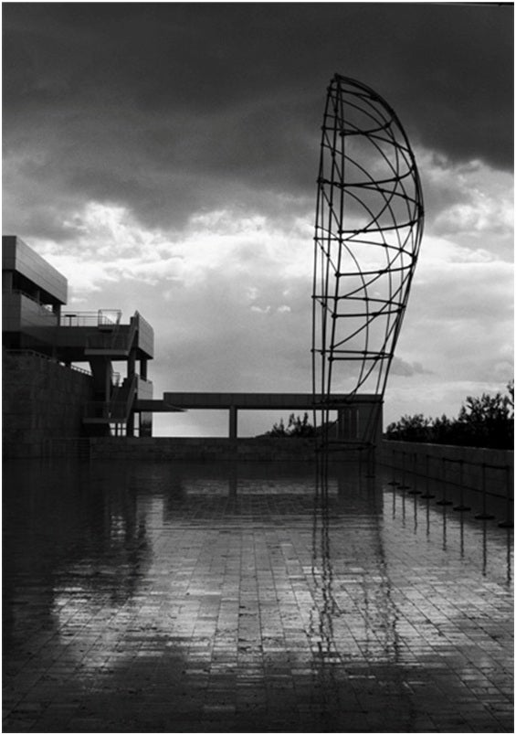
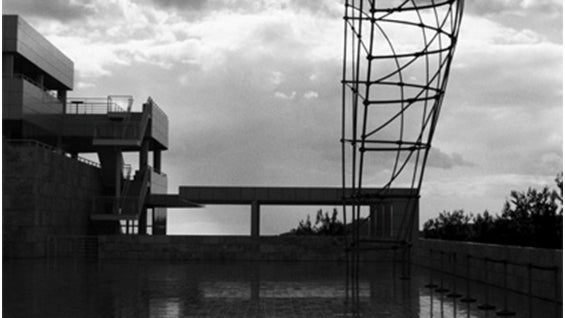
Los Angeles, where I live and breathe, has a couple truly startling structures, and one of those is The Getty Center. Much has been said (and can still be said) about the architecture and art collection, so I'm not going to go there. However a couple years ago I was up there to take some photos of my girlfriend among the gardens and I had wanted to shoot in color ‘cause the landscapes are impressive. But I still had B&W film in the camera, and decided to emphasize the potent silhouettes and shapes and designs of the various buildings and structures, before shooting out the roll and loading up the slide film for my girlfriend.
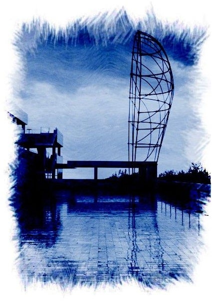
My original images are B&W, as I said, but since the tonal balance is vastly tilted to black, I hoping to find another way to present these images as I'm preparing to decorate the walls in my outer office and to produce some gifts to friends. Everyone was suggesting that I make sepia tone prints, and that appealed to me… until a friend mentioned cyanotype… those blue tinted images that are usually used for blueprints, and I wondered what a distinctively line-enhancing photo process would do; would it make the image pop off the photo paper? This concept invaded my thoughts and I decided to go with it.
The first image I applied Cyanotype processing to is a structure at the Getty Center just off from the main court just as you get off the tram. It was raining off and on the day I took this photo, and that added to the dynamic tonal contrast of this image. The rain-slick marble tiles add a cloudy reflection that balances out the image's edges of darkness.
After applying Cyanotype (Option 4), my photo had this raw, scratched out of the earth feel to it that totally removes the image from the real and firmly plants it in the realm of the abstract. The rough edges of the frame give a chiseled, carved out of stone air to the photo; is the good? I don't know, but it's different… and that's what I'm going for. The fine details in the shadows get crushed down a little bit, and that works with the over changes made to the photo.
The next image that selected was another piece of the Getty Center. Again the contrast ratio is quite high in this photo, but there are still abundant details in the shadows and highlights (the upper left granite wall).
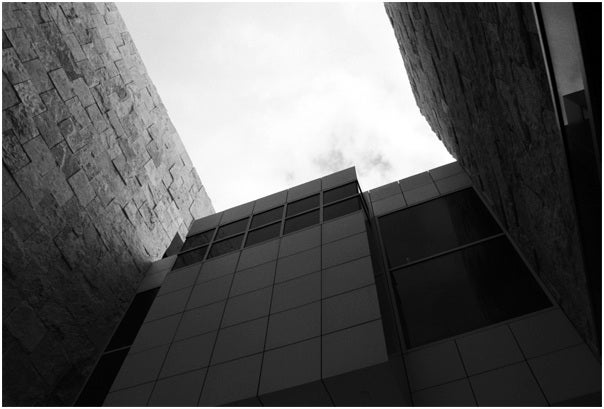
In this original photo, it seems like we're in front of an impossible-to-scale wall that we must get over, because freedom is available on the other side, in the light.
After applying Cyanotype Option 3, the images takes on a sketchy vibe, and by "sketchy" I mean something impermanent, a rushed or fleeting idea that might or might not stand up to the final litmus test of… "Do I like this? Does it say something?" Some ideas are ONLY good as ideas; others actually make a lot of sense when they're brought to physical fruition. Sure, I knew what this image looked like on the computer screen… but as we all know when a photo is properly presented for viewing it takes on different properties.
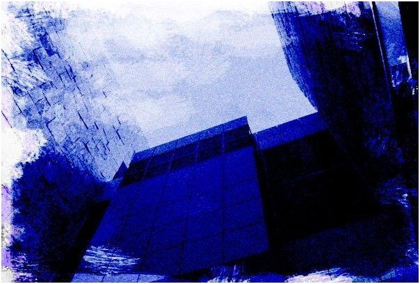
I hadn't expected this result that got from Cyanotype Option 3, and I was curious to make an 8x10 print to test-drive it among friends and colleagues. Some people told that the image has a "lost" or "recently discovered in the attic" quality to it… I guess. At 8x10, the scale of the image is more impressive… especially on glossy photo paper (I created a matte print as well, as I might want to frame the image).
Ultimately, I was pleased the unorthodox, yet palatable re-envisioning of these two images. The Getty Center always sparks something within side me, and I never go up there without my camera (even though it's hard to bring it in the galleries) because you never know what might strike your fancy. The architecture is supreme genius, and the backdrop of the Westside of Los Angeles doesn't hurt either. But you can find new angles to the oft-photographed place just by being there and shifting your focus and concentration. It's hard to ignore the inherent beauty, but go ahead and treat it like a stepchild and find the new compositions that will have people saying, "Where did you take that?"


