While Everyone’s Focused On Growing a Social Media Following, You Should Be Growing Your Email Subscribers
As a small business owner, you may have spent ages building your social media platforms as a primary method of communication with your audience. While this is excellent to do, you’ve also probably experienced the frustration of said followers not converting to actual customers. If your social media following isn’t producing the kinds of sales that you need, you should be spending more attention on your email campaigns. Before you get stressed thinking about the amount of work you envision adding to your already hectic schedule, we are going to lay out everything you should do when shifting your marketing focus to your email marketing efforts.
While most people are concerned with a social media following, they often miss that the biggest analytic they should be concerned with is something called Rate of Investment, or ROI for short. When you are a business with a million followers, but only a small percentage of them are buying your product, it means that the followers aren’t converting into customers and the efforts you are spending on social media aren’t worth the ROI you are getting. Stay with me here while we dive a little deeper.
Email marketing has a higher ROI than any other platform or medium. For every $1 spent on email marketing, the conversion averages a $36 return, while for every $1 spent on social media, the conversion averages $2.80. In short, if you are trying to increase your sales and already have a decent social media following, you should be focusing your time and effort on email marketing – don’t forget that 91% of email users check their inboxes daily.
If you don’t know where to start when creating your email campaigns or your emails aren’t being opened by your current subscribers, we are going to discuss everything from how to create the best subject lines to how to design the perfect email campaign for your audience. We’ll be discussing all of this, along with how you can create eye-catching email graphics in Graphic Designer.
The Kinds of Email Campaigns That Get Opened
Most marketers report sending an average of 4 emails per month, but consumers are reporting that they receive about 21 marketing emails per week and contemplate unsubscribing from the ones that they feel aren’t targeted to them. This is where designing marketing campaigns for your target demographic comes into play.
You should already have determined who your target demographic is and what kinds of designs they are attracted to. You do not need to send four emails per month. Depending on how big your company is, sending one to two will be just fine until you get some analytics back to determine if your audience is liking what you are sending them. A good email open rate should be between 17-28%. This is going to be one of the main statistics we pay attention to when suggesting the kinds of emails you should be sending. If you struggle to know what to send to your audience, we’ve outlined the most important and appropriate scenarios for sending an email below.
Campaigns That Market a Sale
A special offer or discount is the perfect reason to send an email campaign to your email list. If you are having low sales or email interaction, then have a sale. People who are subscribers often wait until a sale is announced before interacting with an email. On average, a customer needs to hear from or see a brand 7 times before they take action to purchase from that brand. This is where social media comes in handy.
Think of social media like fishing and email campaigns like catching the fish. Throw your reel out on social media, be consistent in your posting, and then make sure your followers are subscribed to your email list so that when you send an email about a sale, they have already been primed to purchase. This will keep the consistency of your emails lower and will help to ensure that people do not unsubscribe.
Campaigns for Announcements
Announcement emails have high open rates because they strike a chord of curiosity in viewers. Have you noticed that when scrolling through Instagram or YouTube, the titles that catch your attention most are the ones that pique your curiosity? When people post about ‘Favorite Products of 2023’ or ‘Top 3 No-Makeup Makeup Essentials’, you want to see the products they are talking about. This is the same for email. Create a subject line that leads your audience to want to click and see what you are going to reveal. But make sure that what you tell them is not clickbait. Make the reveal important enough that your audience begins to trust that when they open your emails, they will get rewarded by doing so.
Campaigns to Market New or Restocked Popular Products
This is a personal one but emails that say ‘Back In Stock’ or ‘By Popular Demand’ always get me to click. It is partially curiosity and I also sign up for a lot of restock emails (a great way to capture people’s emails). Brands become viral online usually because of a certain product they sell and people are usually willing to give their emails if they can sign up for notifications for certain products they would like in stock.
Campaigns to Send Free Resources or Subscriber-Only Content
Email lists with higher open rates often send emails filled with free resources and actionable advice. When doing so, you train your readers to always expect something valuable when they see your name pop up in their inbox. This doesn’t just increase excitement around your brand, but it also dramatically boosts your engagement rates too. Free resources you can offer include any digital downloads, worksheets, ebooks, planners, exclusive recipes, webinar access, member-only content, or anything else you think your audience would value.
How to Design an Email Newsletter Header Graphic
It is important to have an idea or framework for how you are going to set up your email campaign before designing the graphics for it. The great thing about most email providers is you can save any design as a template that you can use later. The heavy lifting is at the beginning and then once you have this built, the rest of your email campaigns can simply be edited for faster results.
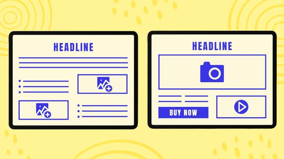
Something to note is your audience will be more inclined to read the entirety of your email if the text is broken up into easily digestible sections. Include enough graphics to keep the reader entertained and to help visually lead their eye down the page. The most important visuals you can create are newsletter headers, section headers, and general photos throughout.
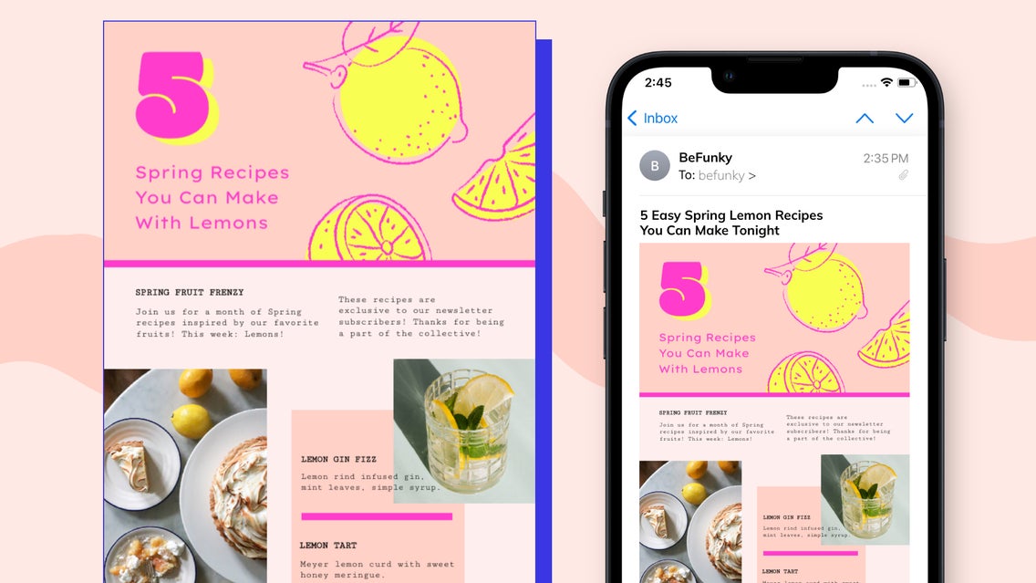
We will create an email campaign header, giving away free and exclusive recipes to our subscribers. This header is for the second email of a spring recipe campaign. The photo will be linked to a web page where you can access the recipes in-depth, driving more traffic to our site.
Step 1: Choose a Template
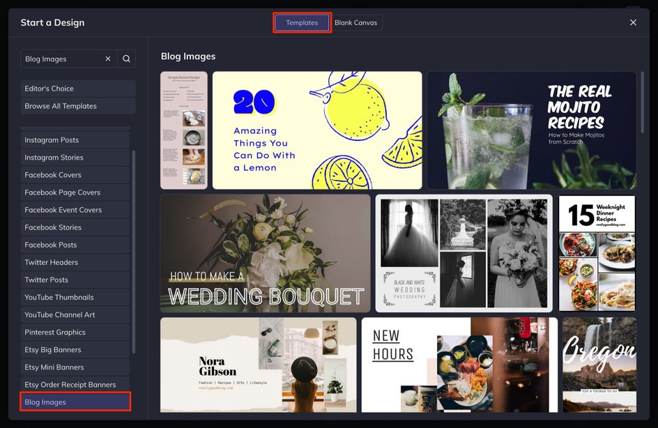
Once you’ve outlined your email newsletter, it’s time to head to BeFunky’s Graphic Designer. Begin by clicking on the Templates tab. I’ve searched for Blog Images to access a template, but you can also use Twitter Headers or Etsy Banners for your email templates. Select your desired template for a preview, then click the Use This Template button.
Step 2: Adjust the Size
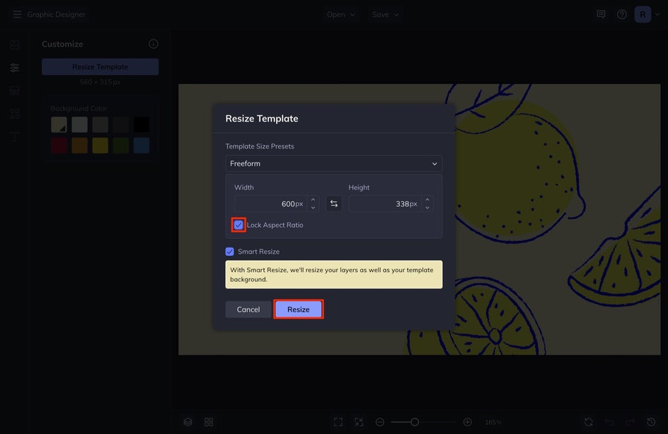
Depending on your email newsletter platform, you may need to adjust the size of your template to match the email newsletter width. Blog Images have been designed with blogs in mind and are also the perfect width for email management platforms such as MailChimp. Most email template widths are 600px wide so we are going to set our canvas to this width.
Select Customize from the left-hand menu and then select Resize Template.
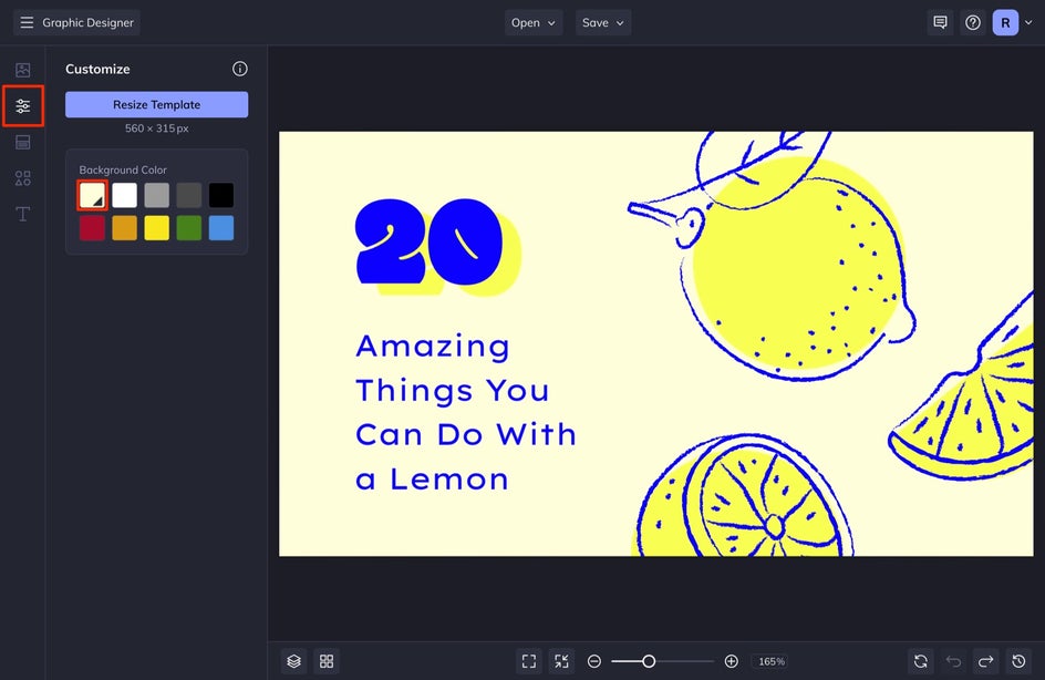
Type in 600 in the Width. You can keep the Aspect Ratio locked to maintain the same shape as the original template.
Step 3: Change the Design
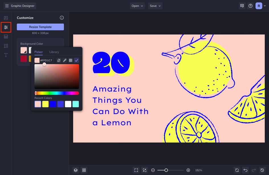
First, you’ll want to change your template’s colors to match your overall brand aesthetic. If you have brand colors, you can type the HEX codes into the palette. In the same Customize tab, select the first square in Background Color. You can then add in your customized brand color in the Color HEX Code section. It will be a number with a hashtag at the beginning. We are going to switch the colors and create a bold summer look for this template.
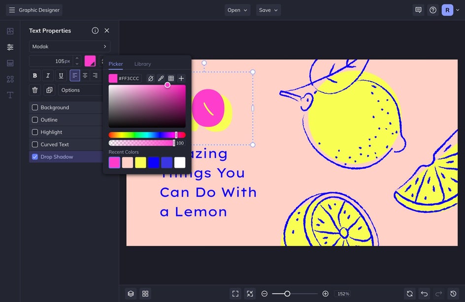
Next, change the font colors by selecting the font and then selecting the Color swatch in the Text Properties menu that appears. In this same menu, you can change the Font, Drop Shadow, and more! Remember, the goal is to make this look similar to your brand, but don’t be afraid to include a typeface you normally don’t use for your branding material, but it still fits the theme of your overall aesthetic.
While here, edit the template’s existing text so it reflects the theme or message of your email campaign. In our design, for example, we designed an email newsletter header announcing a blog article we wrote about what to do with lemons. Start editing by clicking on the text boxes you want to change and typing. When you click on any text box, you’ll find that a Text Properties toolbar appears, where you can change elements such as Font Family, Font Size, Spacing, Paragraph, Color, and more.

If you need to replace an image, click on the photo and an Image Properties toolbar will appear. Selecting Replace Image will allow you to open an image from your own files. Alternatively, you can also locate Image Manager in the menu on the left. From here, you can upload an image from multiple destinations, or even access our extensive library of free-to-use stock photos.
Next up, you can head to the Graphics tab. Select Search Graphics to locate and select from hundreds of graphic elements BeFunky has to offer.
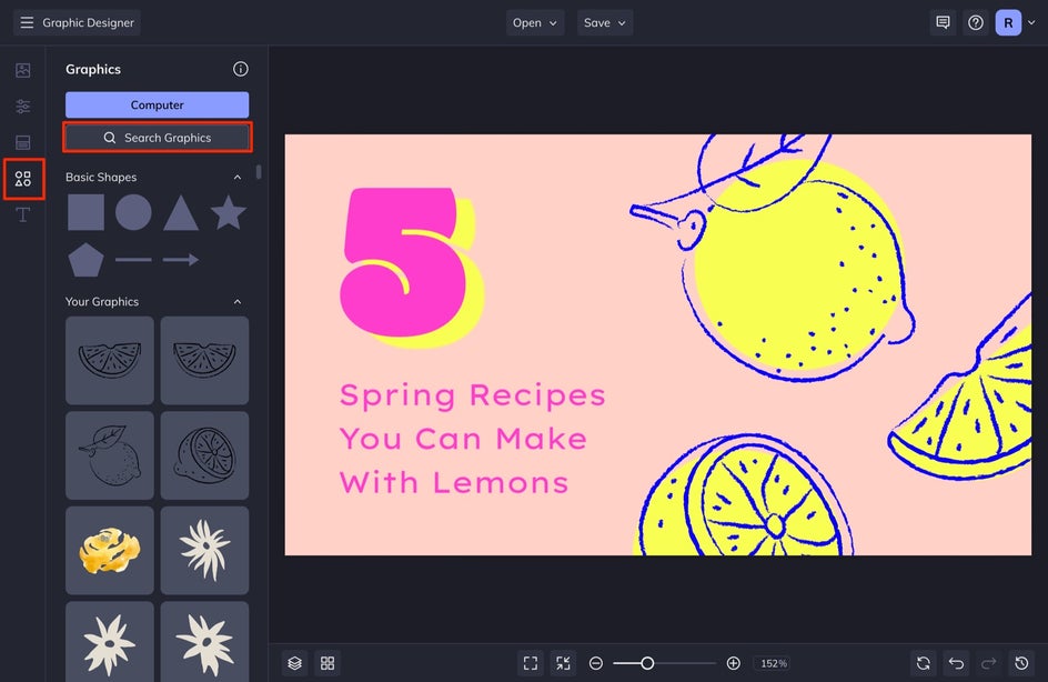
When you click on any of the graphics in the menu that appears, it will be automatically added to your Graphics Library, by indication of a blue check mark.
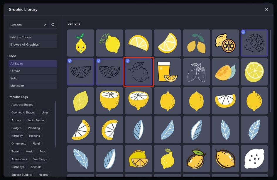
If you want to adjust the color of any element, click on the element you wish to alter and a Graphic Properties toolbar appears. Click on Color Overlay to adjust the color from the swatch.
Step 4: Save Your Email Design
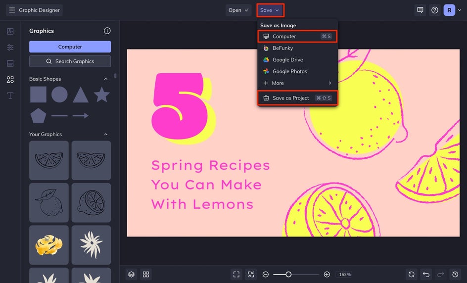
Once you’re finished designing your email newsletter graphic, it’s time to save it so you can add it to your campaign. Click Save from the top menu and then select Computer. Also, select Save as Project, as this will allow you to come back and edit your design in the future.
2 Crucial Things to Include in an Email Campaign for the Most Success
Now that you’ve created your email graphics, your next step is to compile them and send them out to your email subscribers. You can do this via MailChimp, Drip, MailerLite, Moosend, or Squarespace. Once you have your email newsletter designed, take a look at these tips below before you send it off.
1. A Good Email Campaign Subject Line
It’s a fact that email recipients judge emails by their subject line. In fact, 47% of email users decide if they should open an email or not based on subject line alone. Because of this, you’ll want to keep it short and either create urgency or pique their interest with a leading title. Don’t be afraid to also add an Emoji or two to help it stand out among the sea of other emails in their inbox – just be careful though, because too much of this can land your newsletter immediately in someone’s spam. If you need help with writing your titles, check out our article for 6 Ways to Attract Followers With Good Headlines.
2. A Call to Action
You can create the most beautiful newsletter, but unless you include a Call to Action (CTA), people have nothing to act on. It might sound like a no-brainer to you – you are sending an email for a sale, but unless you include a button that says ‘Shop Now’, your readers most likely will not go through the extra effort to type in your URL and find what you want them to find. Simply put, people need to be told what to do and the result of their interacting with your CTA should lead them to the correct place for more of what they are expecting or looking for.
Utilize Email Campaigns to Communicate With Your Audience
Email campaigns are an important part of marketing and if it is something that you’ve either pushed off to the back burner or ignored completely, this is your sign to revive it. With Befunky’s Graphic Designer, you can create great newsletter graphics that grab your audience's attention and gets them to want to interact more with you!


