Tips for Creating an Eye-Catching Flyer for Your Next Event
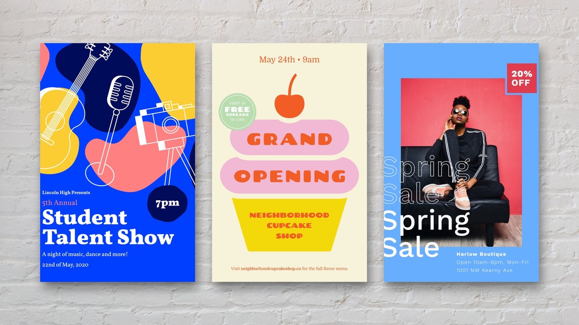
Did you know that even in today’s digital era, flyers still remain one of the most effective forms of marketing? Studies show that 92% of people have been driven to online or digital activity directly from receiving print marketing materials such as flyers. This includes making a purchase online, connecting with a business through social media, or even signing up to attend their upcoming event.
This is great news if you plan on throwing an event for your brand, as it proves that when it comes to getting additional attendees, flyers really do deliver. And did we mention they’re incredibly inexpensive to create too? BeFunky’s Flyer Maker has tons of pre-designed event flyer templates available, so all you need to do is swap out the photo, add your own details, and you’re good to go!
Before you design your own event flyer though, let’s take a closer look at the best practices you need to keep in mind to ensure you get as much engagement as possible.
Components of an Eye-Catching Event Flyer
The aim of any event flyer is for it to be so well-designed that people pay attention to it, share it with their friends, and of course, sign up to attend your event! There are many components that make up a successful event flyer, so let’s take a look at each one.
Legible and Cohesive Fonts
Choosing the right fonts to use on your flyer is very important, as not only will you want them to be easily readable from a distance, but you’ll also need to create a cohesive (rather than jarring) look. Sans-serif fonts are a popular choice for flyers because they don’t contain decorative lines (e.g., serif) on letters, making them a lot easier to read. It’s also recommended that you use a combination of two different fonts on your flyer, including one that serves as a headline to attract instant attention.
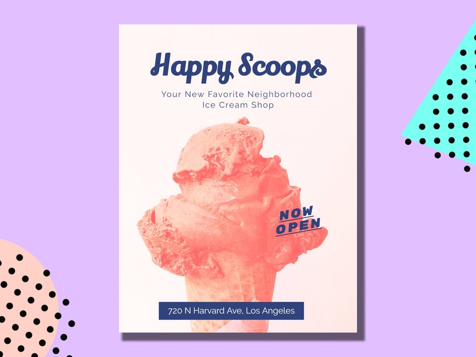
Keep in mind that text should also be large enough, so viewers won’t have to squint to read. You’ll also want the most important text (such as what the flyer is about and any other relevant event information) to be the center of attention.
Relevant Colors
When used effectively, color can instantly grab a viewer’s attention and evoke certain emotions that enhance your message. Brands do this all the time to trigger certain emotions or physical responses from you.
Think about the message your flyer is conveying, as well as who your target audience is. Adults, for example, may be less inclined to read a flyer covered in childlike doodles. Whereas an event such as a health seminar could be successfully conveyed through the color green, which represents freshness, vitality, and wellness.
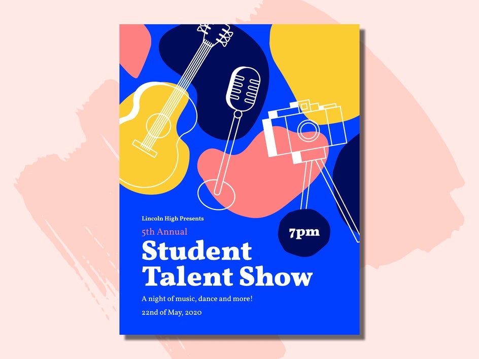
Additionally, you’ll want to ensure your color scheme works harmoniously together, so avoid anything that’s too over-the-top. Remember, the aim is to have recipients holding on to the flyer for future reference and they’re more likely to do this if it’s aesthetically pleasing.
Proper Spacing
Spacing is another important element of your flyer’s overall design, as you won’t want the text all squished together in a corner, nor will you want images to awkwardly overlap one another.
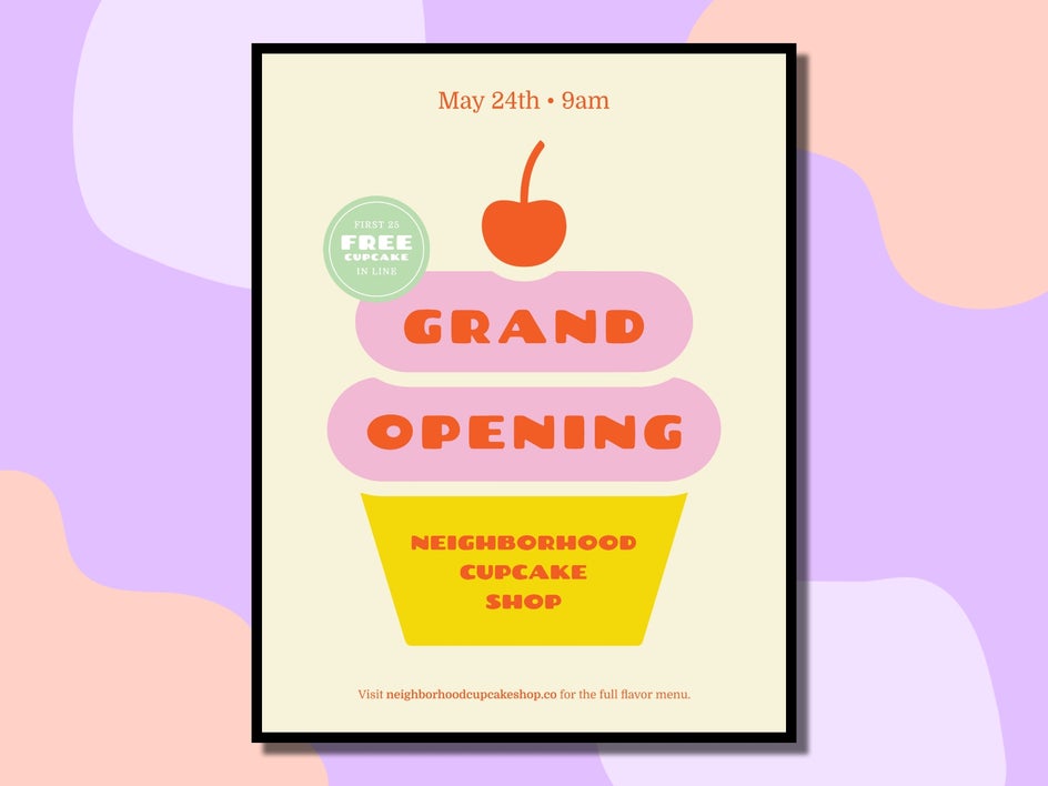
You only have a few seconds to capture the viewer’s attention, and nothing is quicker to turn them off than an unbroken chunk of text or a blob of varied graphics. Spacing your elements out neatly gives the reader time to absorb the information at a glance, rather than leaving them feeling overwhelmed.
What Information Should You Include?
As you can imagine, there are quite a few details you’ll want to include on your event’s flyer to increase its chances of success. We’ve provided a checklist below:
- What the event is (i.e., a festival, market, or seminar.)
- Why you are hosting this event. For example, is it supporting a charity or cause? Or is it for a special occasion?
- When the event will be taking place. Include the date and starting and finishing times.
- Where the event will be held. Include the map address or a URL if the event is taking place online (such as an online sale).
How to Boost Engagement With Your Event Flyer
Now that you know what your event’s flyer should contain, as well as the components for success, you’ll also want to learn how you can get it in front of as many eyes as possible.
Here are our additional tips for ensuring your event flyer makes a lasting impression.
Print Your Flyer
Remember how we mentioned that flyers have a high rate of driving action? To take advantage of this success for yourself, you’ll want to get your flyer printed. Thankfully, there are a few different methods of printing flyers, so it’s easy to find the solution that fits your budget.
Firstly, you can send your flyer design to an online printing service such as VistaPrint. They offer competitive prices for bulk orders (if you plan on handing out hundreds of copies of your flyer) and speedy delivery.
Secondly, you might prefer to visit a printing company in-person to have your flyer printed. If you work within an industry that sees you needing to print plenty of documents, establishing a relationship with your local printing service might prove beneficial in the long run!
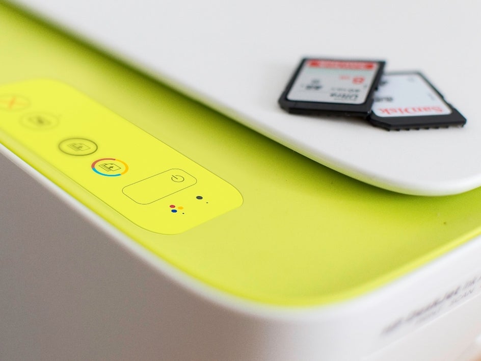
Lastly, those who are on a super-strict budget might like to print their flyer themselves using their own printer. This is particularly useful if you have a high-quality printer that can keep those colors looking bright and beautiful!
Get Them in the Right Hands
Once you’ve got a stack of flyers printed, it’s time to get them in as many hands as possible! There are many ways that you can do this, but the trick is to think about who your target audience is, as well as where they hang out. For example, if you’re advertising a craft workshop, you might ask your local craft store if they can display a stack of your event flyers in their shop. Alternatively, you might even hand-out flyers to those browsing the craft books section at the library.
In order to generate the most awareness about your event (particularly if it’s something that appeals to the masses), you can’t go wrong with dropping your flyers into letterboxes, as well as handing them out in high-traffic places such as cafes, your local shopping center, or even to passers-by in the street. You’ll also benefit from pinning your flyer to noticeboards around your city.
Create a Digital Version
Another great tip is to utilize the digital version of your flyer. Be sure to share the image across all of your social media platforms and provide a simple call to action encouraging your followers to share it with their own following.
If you or your business has built up a large email list, then you can also insert the flyer into an email campaign to further spread the word. Again, encourage readers to forward the email to any of their friends or family who they think might also be interested in your event. This is an excellent way to generate free, word-of-mouth advertising!
Offer Something Extra
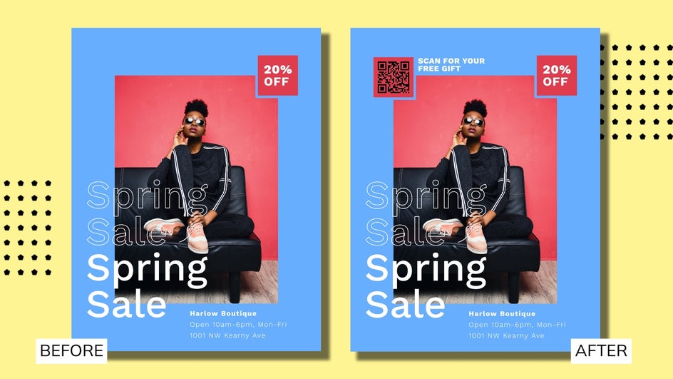
Lastly, if you want to boost your flyer’s engagement rate even more, we recommend adding incentives to it, such as a voucher, coupon code, or QR code. Not only do people love a discount or a freebie, but they also provide you with a simple way to measure your flyer’s success. As soon as someone uses that specific code or voucher, you’ll know that they’ve engaged with your flyer. Too easy!
Ready to Create Your Own Event Flyer?
You don’t need a large budget or graphic design expertise when BeFunky’s Flyer Maker is here to help. Armed with these event flyer tips for success, you’re now ready to create your own flyer and get the word out about your upcoming event.
Explore our range of event flyer templates to see just how easy it is!


