Top 10 Graphic Design Trends for 2020
While 2019 was a huge year for breaking conventional graphic design rules, 2020 is set to be even bigger than ever. For the new year, we’ll be carrying on some of the trends which emerged in 2019, such as maxi typography, colorful minimalism, and collage inspired design. And when it comes to what’s new on the horizon? We’re predicting an emergence of fun trends such as line art, abstract illustrations, and ‘Classic Blue’ everything, as well as a revisitation of trends from years gone by, such as metallic and gradient color schemes.
The best bit? Staying on trend in the new year doesn’t have to be hard. BeFunky’s Designer has tons of design templates and tools to help you nail each of the looks below. Graphic design in 2020 just got a whole lot more fun!
Upcoming Graphic Design Trends
Ready to take a glimpse into the (not-too-distant) future? Here are our top graphic design trend predictions for 2020.
Metallic Design Elements
Metallic elements were popular years ago, but our love for all things shiny never truly went away. In 2020, you’ll notice hues of gold, silver, copper, and bronze popping up everywhere from social media and branding, to packaging, advertisements, and so much more. After all, why make something a one-dimensional, dull color when you can make it sparkle?
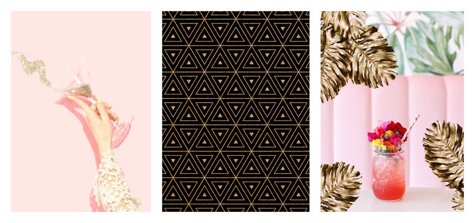
As a general rule, try to pair metallic elements with an overall minimalistic design, as the aim is to use shiny metals as a way to capture attention. Brands are particularly looking to use gold in their graphic designs, as it conveys a sense of luxury and elegance.
Big, Bold Typography
Remember how big maxi typography was in 2019 (both literally and figuratively)? Well, in 2020, it’ll be reaching even greater heights. Typography will be so ‘maxi’ that designers will be splitting words into multiple lines to really capture their audience’s attention.
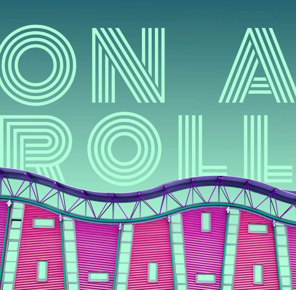
When it comes to boldness, the thicker the better. Heavy fonts will be popular with the new era of typography, and similarly to 2019, the letters may even go beyond the page.
Masking Design Elements
Masking design elements like text and shapes with imagery is on the rise. Paired with bold typography, it can be really intriguing to add just the right image within the text to bring it to life. Luckily, masking is easy to accomplish in BeFunky! Simply type out your text, style it how you want, and drag-and-drop an image right inside to fill the text.
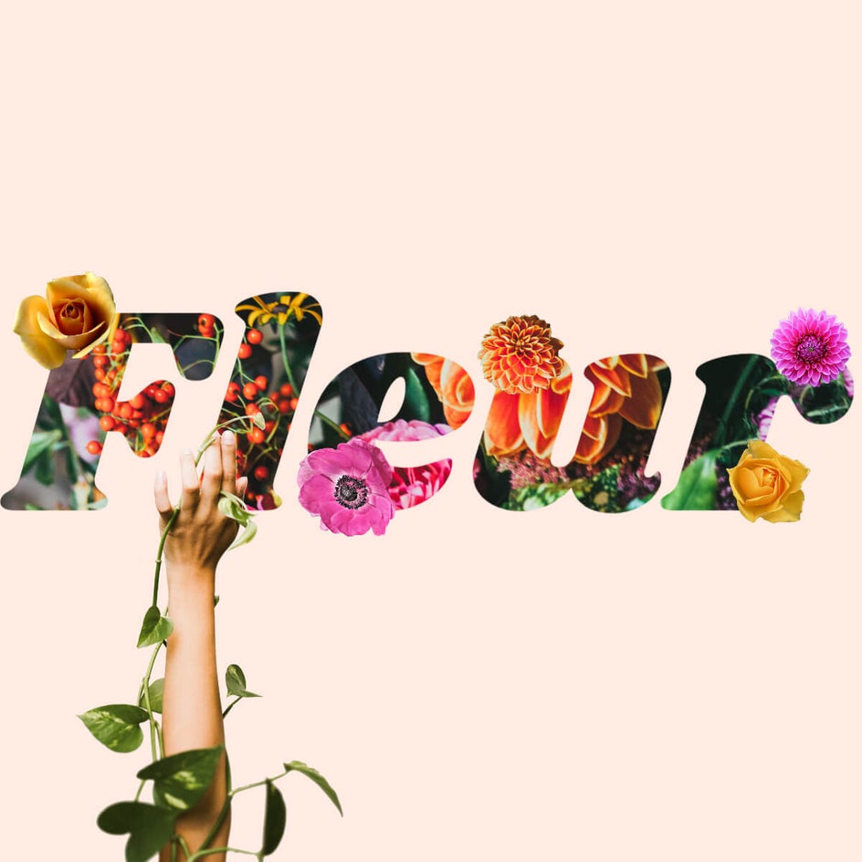
You can also mask shapes in your graphic designs using the same method. That way, it’s easy to make an image triangular, circular, hexagonal, or otherwise geometric.
Hand Drawn Collage-Style Imagery
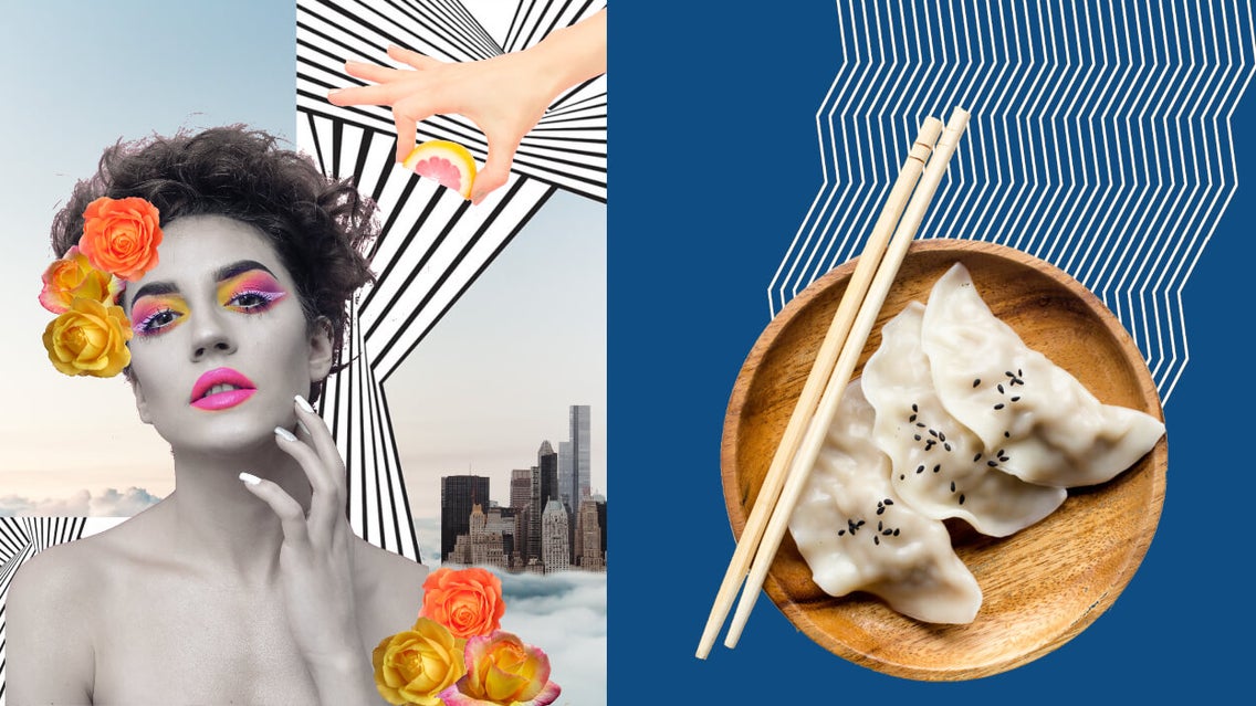
Remember those doodles you used to do as a child on the front covers of magazines? A smiling celebrity would suddenly sport devil horns or blackened-out teeth, thanks to your pen. This style, we’re pleased to say, is making a comeback in the world of graphic design for 2020, adding intrigue and playfulness to an otherwise standard photo.
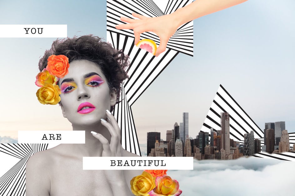
Layering your imagery in “freshly cut out” styles (like you would with a handmade collage) gives your imagery a totally unique, on-trend look. The Cutout tool comes in handy for this kind of effect, as you can easily cut out subjects from your layers, just like you would with a magazine, then arrange them as your heart desires! These handmade touches not only give us the freedom to be as creative and freeform as we’d like, but also provide a great opportunity for brands to stand out from more traditional forms of marketing.
Abstract Illustrations
For a while now, companies have been using similar imagery in their branding, meaning that eventually it all started to look the same. In 2020, they will be taking a stance against this, instead choosing to embrace illustrations of a more abstract, quirky, and unique appearance to help them stand out from the pack.
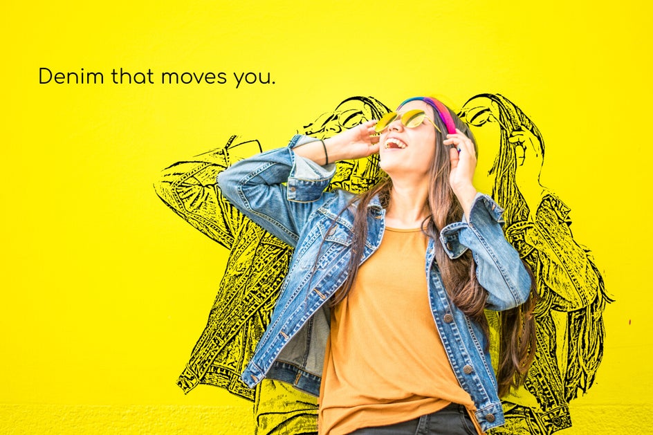
The best part about this trend is that you can easily use BeFunky's Artsy effects to create layers of illustration (we used the Sketcher effects on the above image!). Alternatively, you can use the Paint Brush tool in the Touch Up tab to create some hand drawn free-flowing shapes and one-of-a-kind patterns. When it comes to the abstract illustration trend, your creativity and imagination knows no bounds!
Line Art
A love of line art in the graphic world began to emerge in 2019, so expect this trend to go full speed in 2020. Line art involves the use of line elements, and they're especially appealing when the lines form unexpected paths and shapes.
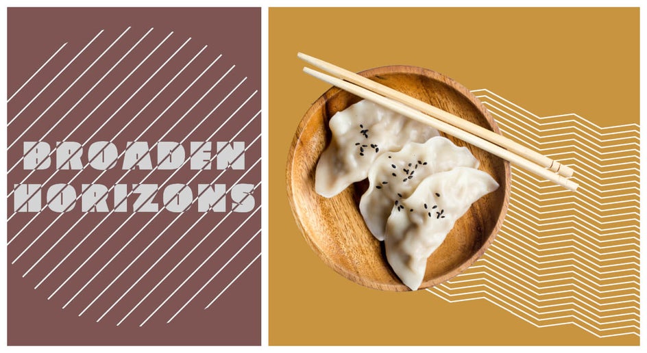
When done well, line art is clean, unobtrusive, and draws the eye toward the main subject in your graphic design.
Organic Aesthetic
Speaking of simplified styles, another graphic design trend to take on in 2020 is the organic aesthetic, which focuses on natural imagery, earthy color schemes, and calming lines.
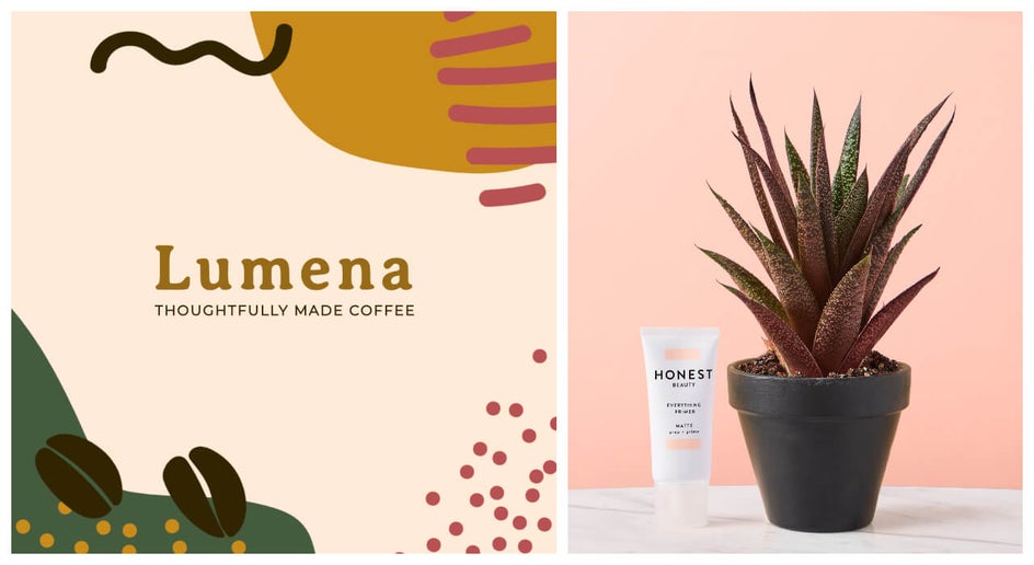
Design elements become paired back in an effort to portray what we all crave from a brand: simplicity and honesty. Think stripped-back elements (whether it be patterns, shapes, fonts, or photography) that are inspired by nature and the world around us.
Gradients
Gradient color schemes were popular in the 90’s and they seem to be even more popular today! Gradients add depth to flat designs, visual interest to backgrounds, and intrigue to color overlays. You can keep your gradients subtle by doing a light color that fades into a darker shade of the same color, or go bold with multiple colors that work well together.
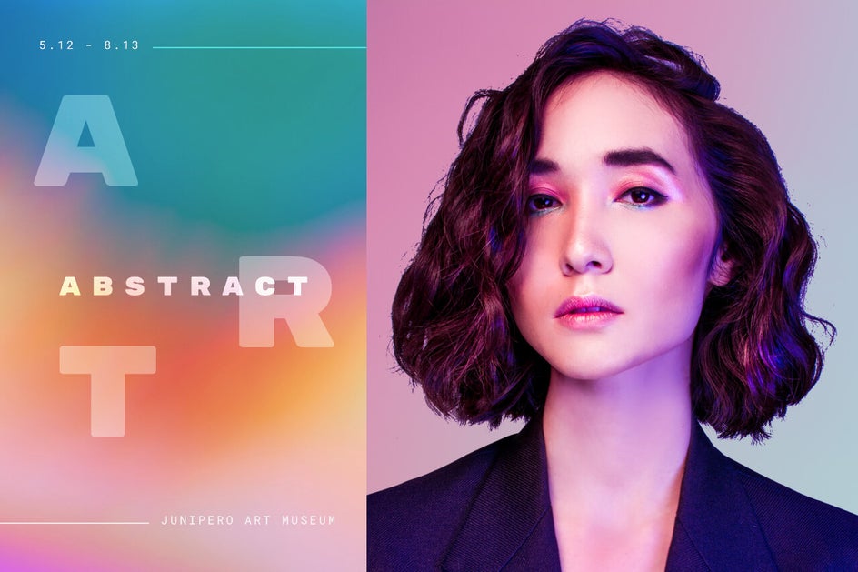
We saw a ton of gradients in 2019, but going forward, you’ll find gradient colors in package design, web design, marketing graphics, logos, and basically anything that you want to make pop.
Color Minimalism
While the colorful minimalism trend of 2019 focused on pops of contrasting color, 2020 brings a whole new meaning to the term. Instead, designers will be concentrating on just one main color, often accompanied by neutral colors such as black or white, and pairing everything down in the design to achieve this minimalistic look.
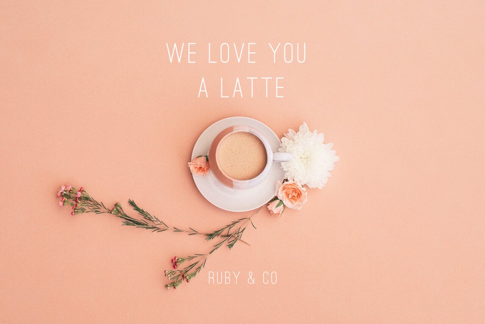
Think single colored overlays, colored text against black and white imagery, or using just one harmonious shade across the entire composition.
Color of the Year: Classic Blue
Each year, as a new one is upon us, Pantone announces the color they have chosen to represent the following 12 months. For 2020, the Pantone Colour Institute have chosen Classic Blue (PANTONE 19-4052), a deep blue shade that's at once comforting and relatable – something they believe is important as we begin the uncertainty of a new decade.
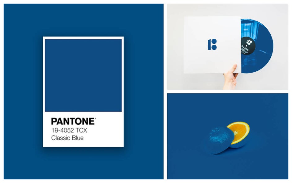
The Pantone Color of the Year isn’t anything to be taken lightly, as the shade strongly influences everything from clothing, accessories, and homewares, to – you guessed it – graphic design. If you want to incorporate this specific color into your own graphic designs, simply use the Color HEX Code #0f4c81.
Conclusion
With fun and bold trends such as 3D depth and realism, maxi typography, abstract illustrations, and more, it’s hard not to be excited about graphic design in 2020.
Ready to get ahead of the curve with your own work? Start exploring our Designer to easily create on-trend graphics for social media, business marketing, and anything else your heart desires!


