Introducing Light and Dark Themes
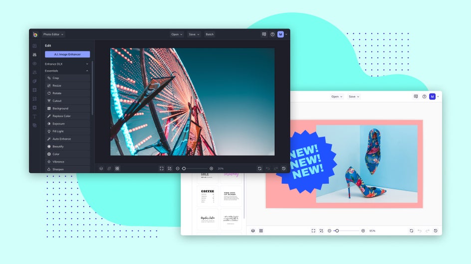
Our product is constantly evolving to make your editing process as smooth and easy as possible – allowing you to focus on what you do best – being creative. Alongside our site refresh, which includes a new color scheme and crisp category graphics, we’ve also added the option to alternate between Light and Dark Themes during the editing process. Switch between them with a single click in the Settings menu. It’s that easy!
Light vs. Dark Themes
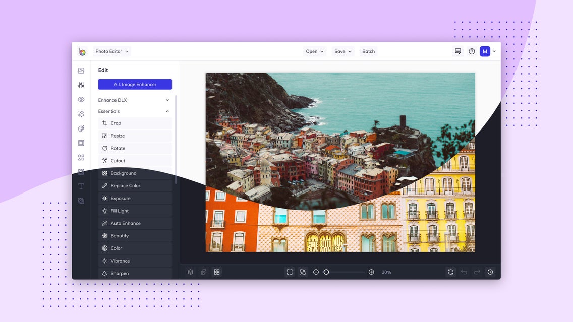
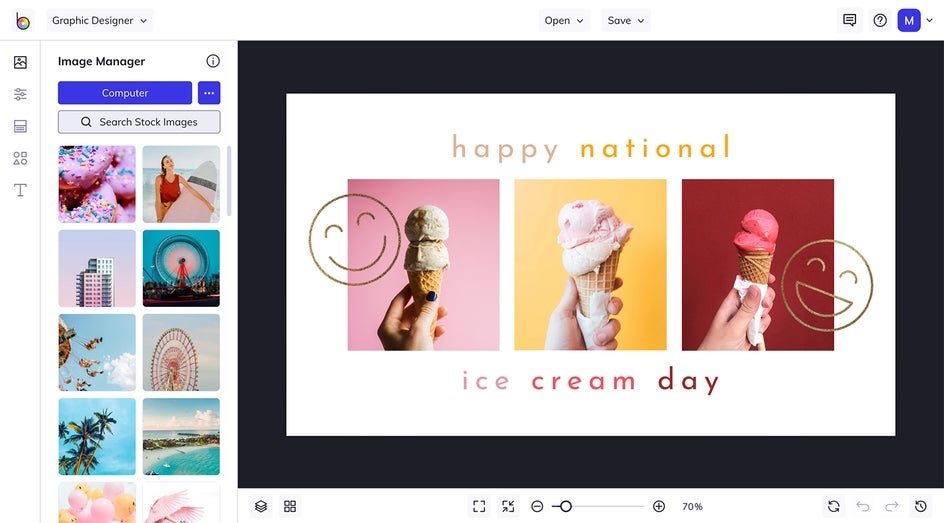
This change gives you the ability to customize both the Theme and the Canvas colors. We created this feature because there are several pros to each Theme, so having the option gives you the freedom to choose what works best for you. And the best part is, you can mix and match as much as you like! Here, we’re going to dive into some of those pros of the Dark and Light Themes and Canvas colors so you can be properly informed before experimenting with this exciting feature.
Light Pros:
During the day, the Light Theme may improve readability. With the Dark Theme, your pupils must dilate to take in as much light as possible – which is beneficial at night, but it can make reading difficult during the day. However, the Light Theme makes your pupils constrict and focus more, which improves sharpness. This is similar to how camera apertures work.
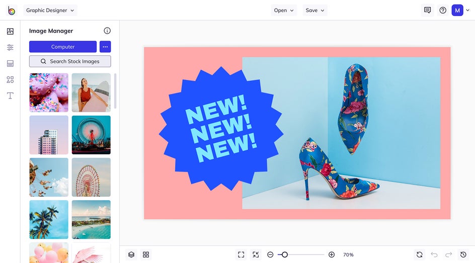
And if you are working on a project that involves darker colors, the Light Theme can provide a better artistic perspective. Especially if you are working with dark text on a light background. While creating graphic designs in the Designer, you will be able to see those subtle tonal changes that can help you avoid oversaturating your work.
Lastly, when thinking about Canvas color advantages, the Light Theme with a Light Canvas allows for absolute clarity of both the Canvas and the tooling. And on the other hand, the Light Theme with a Dark Canvas draws your eyes to the tooling, which is beneficial for those who are more familiar with our Editor’s menus.
Dark Pros:
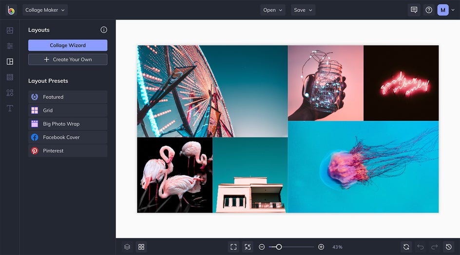
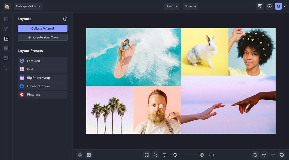
If you’re a night owl who likes to work under the cover of darkness, the Dark Theme is for you. With a toned-down interface, you can save your eyes from strain and the long-term risk for myopia. And when you are finally ready unwind, rest easy as a darker screen produces less blue light – which has been linked to disrupted sleep patterns.
The Dark Theme is also suited for those with impaired vision or color blindness as it is easy to discern graphics and text against a dark background. And because your display controls each pixel individually, those that are not in use waste no power – thus saving you battery and assuring that you can keep editing for hours.
In terms of Canvas color advantages, the Dark Theme with a Dark Canvas gives a clearer perception of graphics and colors. And for those who are more familiar with our Editor’s menus, the Dark Theme with a Light Canvas may provide more focus on the Canvas, rather than the tooling.
How to Use the Light and Dark Themes
Now that we’ve reviewed some of the pros of each Theme, let’s learn how to configure your settings to find that perfect balance:
Step 1: Head to Settings
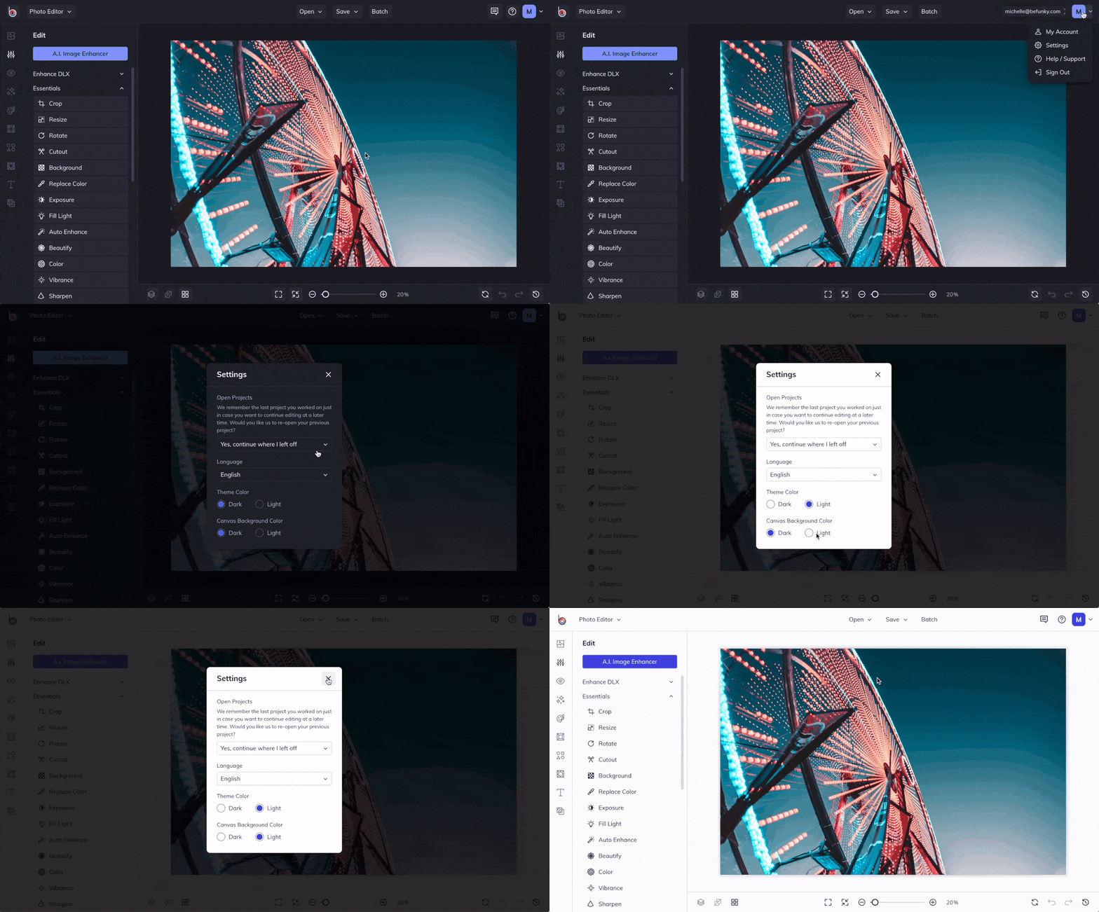
In the upper right corner of the Editor, simply click on your profile icon and then click on Settings from the drop-down menu.
Pro Tip: As a shortcut, you can also click Command/Ctrl + i.
Step 2: Make Your Selection
In the Settings menu, you will see options for Theme Color and Canvas Background color. You can choose between Dark or Light for both the Theme and Canvas color. Having a fully dark or fully light interface is often preferred, but feel free to try different combinations.
Mix and Match to Your Heart’s Content
Now that you know all you need to get started with this new feature, it’s time to get creating! Alternate the tooling or Canvas color depending on the time of day or your project needs. Whatever you choose, we know you’ll love it.
