5 Ways to Step Up Your Social Media Game
Almost everyone uses social media, making it one of the best ways to cement your brand, promote your blog, or raise awareness for a cause. But just because it’s easy to post on social media doesn’t mean it’s easy to make your posts look good! If you’ve ever been frustrated trying to create appealing social media graphics that get people to hit that Follow button, you’ve come to the right place. With these design tips and tricks, all made possible with the Graphic Designer, you can create beautiful content in minutes and save energy for other tasks. Here’s how to step up your social media game in five easy steps.
1. Keep it In the Color Family
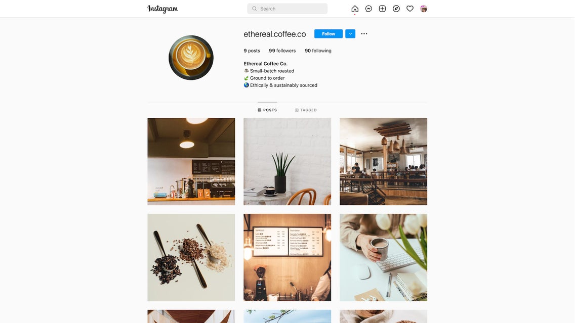
One of the classic tricks to a beautiful Instagram feed is to stick to a color scheme, using 1-2 main colors to keep your grid layout cohesive. This rule can help you out with prettying up your other social media accounts, like Facebook and Twitter, too. Having a color palette doesn’t mean that every post has to look exactly the same! Make sure you have 3-4 secondary colors that give you some flexibility with your designs: You can use these colors for text, graphic elements, and more.

You can add each of your brand colors to your color Library for easy access. Plus, use the “Color Overlay” or “Tint” features in the Image Properties tab to change the hue of photographs and graphics. This will help make sure your social media designs match in color and tone across the board.
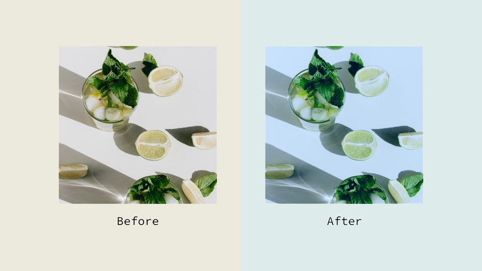
If part of your image doesn’t fit with your color scheme, such as the background, you can always cut it out with the Background Remover and replace it with a shade in your color palette. Sticking with your brand colors is key to ensuring your social media pages look aesthetic and professional.
2. Make Your Text Look Beautiful Too
Sure, the image is the first thing you see when you’re scrolling through social media. But if you’re trying to share information or promote a product, then the words matter just as much as the photo. Bland, crowded, or difficult-to-read text can easily make users skip ahead to the next post on their feed. So how do you design your typography in a way that clearly stands out, but also looks good?
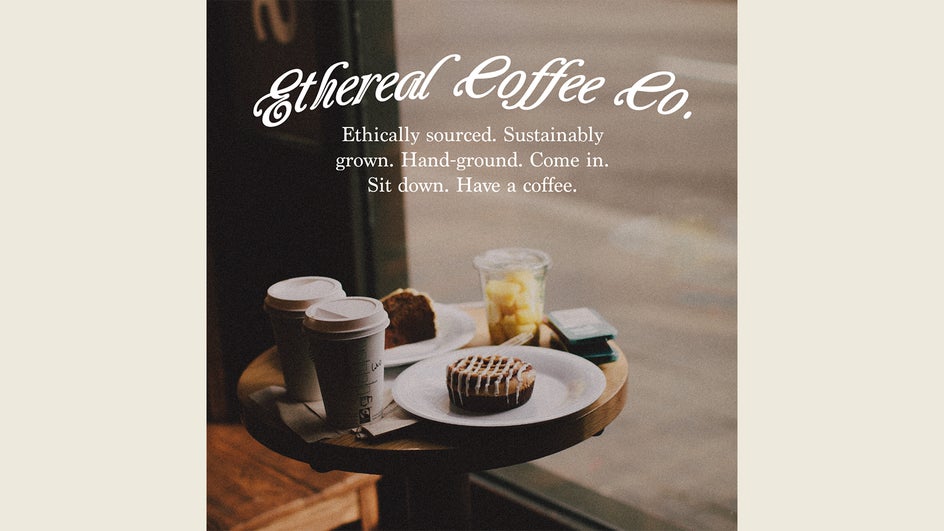
Our first recommendation is to stick to just two fonts or typefaces: One big and bold for the main focus of your post, one smaller but easy to read so you can fit more information in the text. Secondly, remember, less is more! If there are words that can be cut out or moved to the caption, do that so that your image remains clutter-free.
When picking a typeface to use as your primary font, it’s important to keep your brand in mind: Is the tone quirky, serious, technical, or energetic? Pick a font that aligns with your brand, like a handwritten scrawl for your recipe blog, or a luxurious cursive for your jewelry business. For the secondary font, choose something simple that is readable even at a small size.
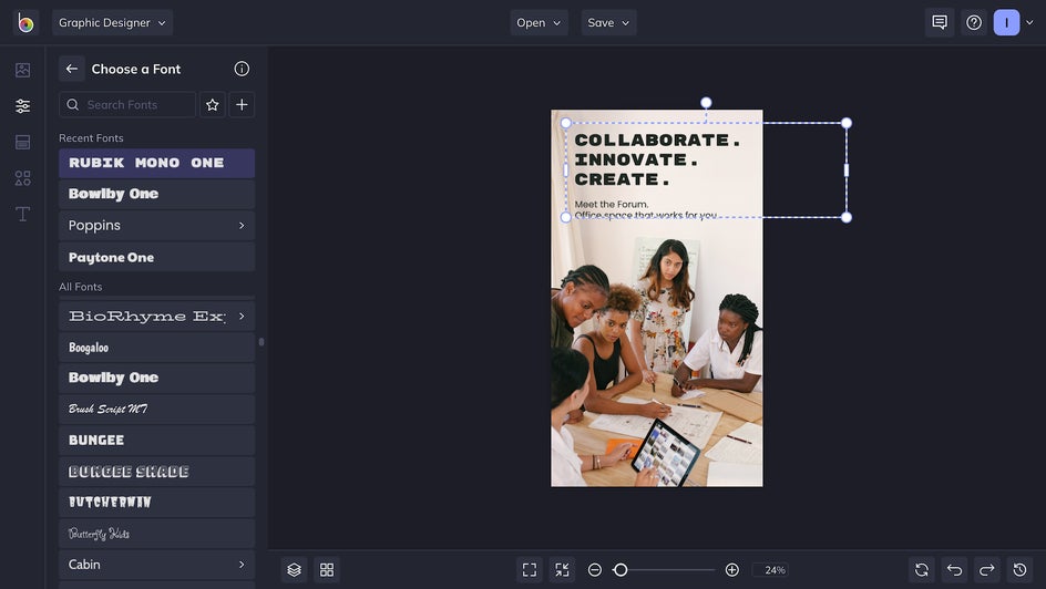
You can find hundreds of different typefaces in the Graphic Designer, but if none of these do the trick, you can always add a Google Font or import your own.
3. Save Time With a Template
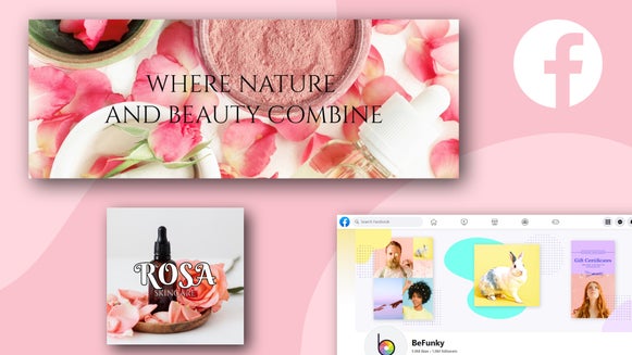
Sometimes you have content at the ready and just want to put together a quick post—but then you end up spending way too much time on the design side, trying to make it look picture-perfect. Or maybe you have seven posts to create for this week and not enough time to make them! Either way, leave the design struggles to us. With BeFunky’s Social Media Templates, you can create Instagram stories, Facebook covers, Twitter headers, Pinterest graphics, YouTube thumbnails, and more. Hundreds of premade templates allow you to get a post on any social media channel in minutes!
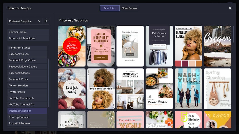
4. Follow the Formatting Rules
Every social media platform has different rules of formatting. For Instagram, the traditional size is a 1080x1080px square; for Facebook, it’s 1200x630. Twitter and Pinterest have their own optimal image sizes as well. If you want to publish the same post across multiple platforms, you have to resize it multiple times or run the risk of cropping out important information.
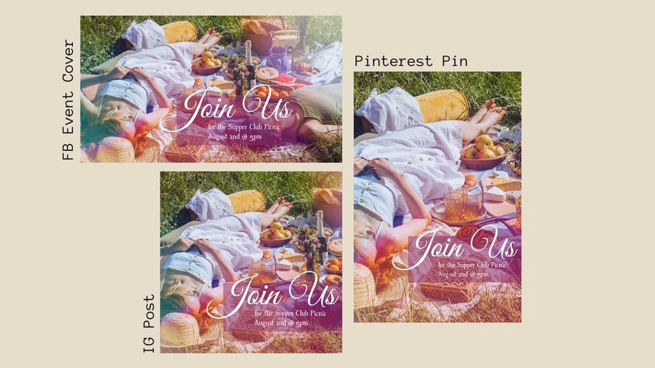
Resizing images for so many platforms can be time-consuming and difficult. Luckily, with preset templates and Smart Resize, the Resize Image Tool allows you to easily optimize your image for every social media channel. No more rearranging the elements of your image every time you crop and resize it—just a few clicks and you’re done!
5. Grab Attention With Graphics
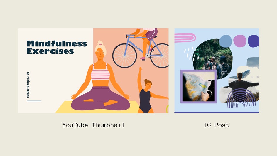
Do you ever feel like your social media posts are lacking a little individuality? Are you trying to add some creative flare to a text-based post? Spice things up with graphics from our Graphic Library. There are thousands of options available to you, and they cover every theme under the sun. Have a cosmetics brand? Try one of our many makeup or skincare graphics. Want to create an infographic about your company’s sustainability? Just search “environment” or “sustainable.” You can also add ribbons, arrows, speech bubbles, abstract shapes, and more. Graphics are sure to up the visual interest of your Instagram posts or YouTube thumbnails in no time!
Step Up Your Social Media Game With BeFunky
Social media is a complicated beast, but all you really need to tame it are some good ideas and the right tools to execute them. The ability to create stunning, viral-worthy posts is right at your fingertips! Simplify your content creation process and check out the Graphic Designer today.


