How To Create Perfectly Sized Twitter Headers

Whether you use social media for business or simply to connect with family and friends, chances are you’ve noticed the popularity of visual content on these platforms. From holiday snaps and entertaining memes, to funny gifs and snippets of video – these are the things that keep us logging in for more!
Our love of visuals shouldn’t come as a surprise. After all, the human brain processes images 60,000 times faster than text. That’s quicker than you can blink! The fun facts don’t just stop there though. Did you know we retain a whopping 80% of what we see, compared to just 20% of what we read? If there’s one thing we can all agree on, it’s this: visuals are king.

Social media platforms have taken notice of this shift towards visual content too, as many are continuously creating additional ways for us to interact visually with our following. A great example is the header feature on Twitter, which allows both businesses and personal accounts to further personalize their profile by adding a dominant image at the top of their page. This gives businesses an exciting opportunity to tell their story and connect with their audience beyond a 160-character bio or a 140-character tweet. With more than 328 million monthly users and 500 million tweets per day, Twitter users now need to make the most of their profile’s visual assets to stand out from the crowd!
We know what you’re thinking though: how do you create a professional-looking Twitter header without having to spend a cent? Thankfully, BeFunky is here to help and we’re going to show you how to create the perfect Twitter header – no graphic design skills needed!
What Makes a Great Twitter Header
Firstly, let’s look at what separates the average Twitter headers from the leaders of the pack. One of the most important elements to get right is the sizing, as you don’t want your header to look distorted. Your header image should be horizontal in orientation and uploaded at a size measuring 1500 x 500 pixels.
The good news is that our Designer provides templates specifically for Twitter headers, allowing you to get the perfect size every time. Getting the right dimensions is just a click away, so you can spend time on what matters most: creating a visually stunning header that stands out from the crowd!
If your Twitter profile represents your business, you’ll also want to make sure that it’s cohesive with the rest of your company’s visual branding. Think about elements such as the color scheme, font, or imagery associated with your business and ensure these remain on-point in your header too! Additionally, you’ll want to use your Twitter header to further communicate to your audience what your business (or if you have a personal account, yourself!) is all about. How can this be summed-up in one single image?
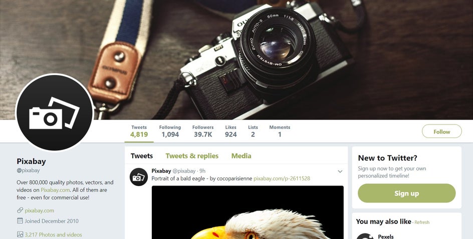
A great example is Pixabay’s Twitter header, which features an image of a camera to reinforce their services of providing stock photography. Additionally, the image compliments their logo (which also features a camera), while the dark color scheme further ties-in with their almost-black logo. This branding is also used across Pixabay’s website and other social media platforms, helping to create an aesthetic that is instantly associated with the company.
You also shouldn’t be afraid to use a header image that is both bold and eye-catching. After all, you want your Twitter profile to be memorable and stand out from the pack! As long as the colors within your header complement (rather than clash with) your overall branding, then you’re onto a winner.
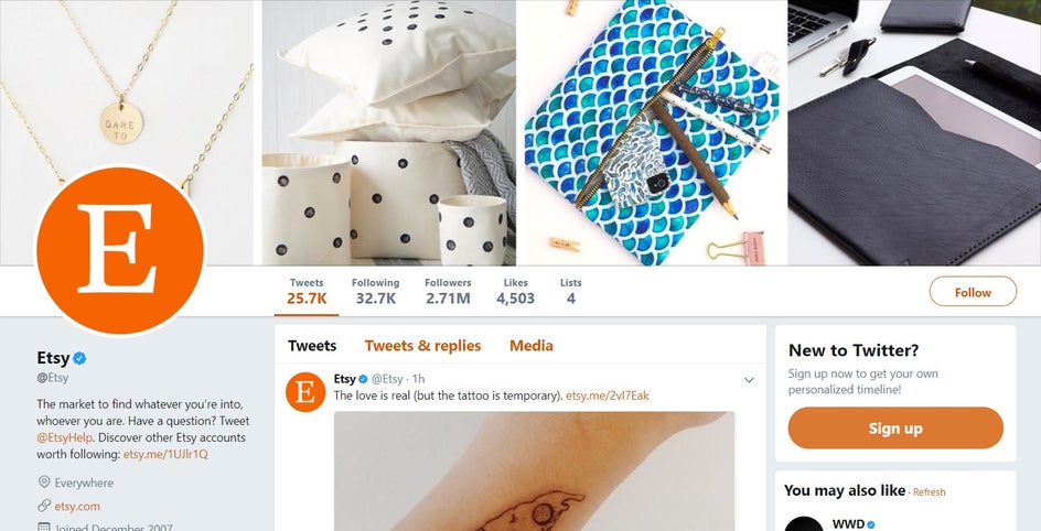
Take Etsy’s Twitter header, for example, which the company uses to showcase some of the most popular products on their platform. While the color scheme remains quite neutral, they’ve added a vibrant pop of aqua for that extra wow-factor. Despite this, the colors of the header all compliment, rather than clash with, their signature orange branding. The imagery used further reinforces what the company is all about: high-quality, handmade goods.
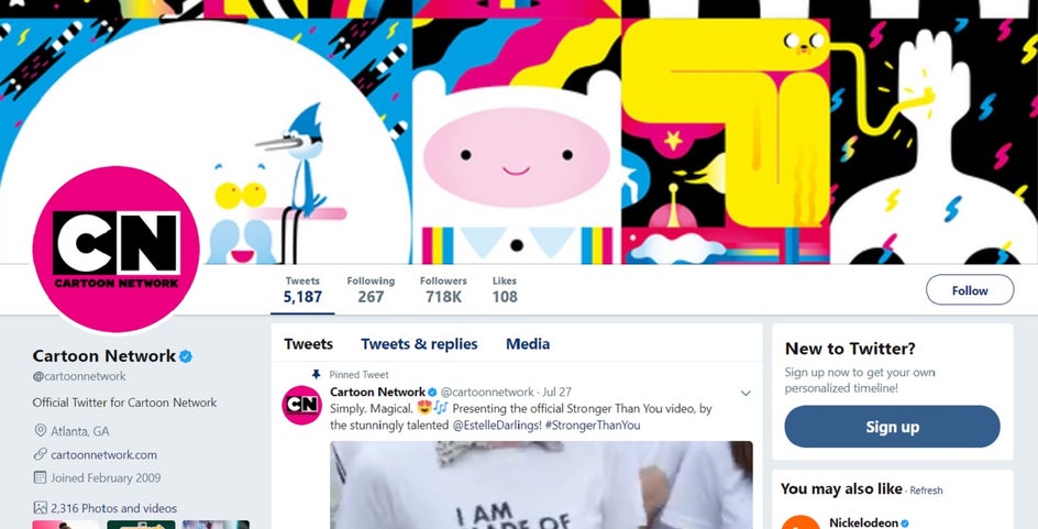
Your Twitter header can also be graphic-driven if that's more on-brand with your company or personality. An example of a company who isn’t afraid to use a vibrant graphic header that demands attention is Cartoon Network. They’ve still included their brand’s signature colors of black, white, and pink within the image, but taken this a step further with bright primary colors such as blue and yellow. The header is fun and child-like, while portraying characters from one of Cartoon Network’s most popular TV shows.
With all of these examples in mind, think about what kind of imagery will best represent you or your brand. Whatever aesthetic you're going for, BeFunky's design templates can help you create an engaging header to enhance your Twitter presence.
How To Create a Twitter Header with BeFunky’s Designer
To access the header templates in BeFunky’s Designer, simply locate them under Social Media Headers, in the Twitter section. From there, select the one you like best, then click ‘Select Template’ to confirm your choice. Your chosen template will then load in the Designer, ready for you to tweak it all you like!
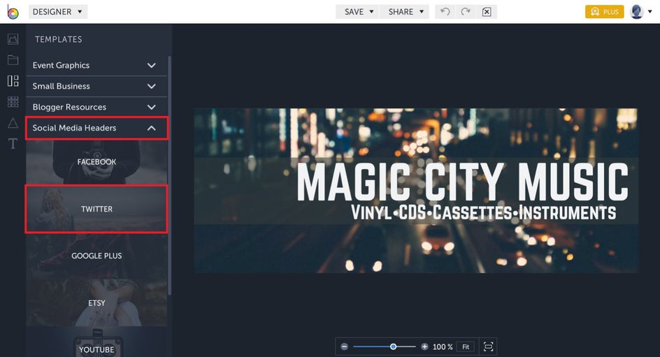
Clicking on individual elements (such as the text, background image, symbols, etc.) will bring up the menu for that element, allowing you to customize it. To move these elements around, just select them with your mouse and drag them to where you’d like them to be. Additionally, you can change the size of an element by dragging its corners and edges outwards (to make larger) or inwards (to make smaller).
The background image is the most important visual element of your header, so click on this to access the Image Properties toolbar. From here, you can overlay the background with color by choosing your desired tint in the Color Picker. You can also adjust the Intensity of this tint on the slider below. Additionally, you can experiment with Opacity and Blend Mode to further customize your header’s background image. You also have the option to edit the photo further by selecting “Open Image in Photo Editor” and accessing BeFunky’s entire library of Photo Editing effects. There’s no limit to your creativity!

Want to replace the template’s image with one from your own computer? Simply click the “Replace Image” button before selecting one of your own files.
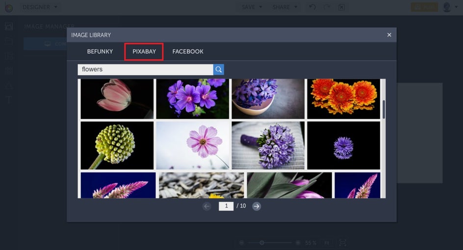
If you don’t already have an image in mind for your Twitter header, fear not. BeFunky’s Designer allows you to search Pixabay without ever having to leave your project, so you also have access to over a million free stock photos to use. Just head to the Image Manager tab in toolbar on the far left. Click the three blue dots, followed by Pixabay, and you’re ready to go! Just type what images you’re looking for in the search bar to begin your quest!
For those of you who would prefer to start with a blank canvas as your background instead, the Delete button in the Image Properties box is for you. From here, you can select a color from the Background option in the toolbar on the far-left and create a solid-colored background. Perfect for adding text, your logo, or creating a graphic-driven header from scratch.
Want to add or alter pre-existing text? Clicking on the template’s text will bring up the Text Properties toolbar, allowing you to change the font, font size, spacing, alignment, color, and more. Double-clicking on your text will also enable you to edit what it says. Alternatively, you can insert new text by clicking the Text option on the side toolbar.
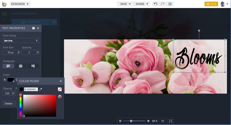
Pro Tip: Notice that in the Text Properties toolbar, there are two categories of fonts: Ours and Yours. From the Ours tab, you're able to use a wide variety of fonts from BeFunky's extensive library. From the Yours tab, you have access to every font stored on your computer, including fonts you've downloaded.
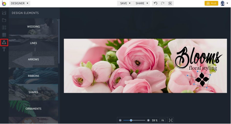
If you need to add some graphics to your header, the Designer even has a wide range of Design Elements to choose from and these can also be accessed from the side toolbar. You’ll find everything here from symbols and illustrations, to frames, lines, social media icons, and more!
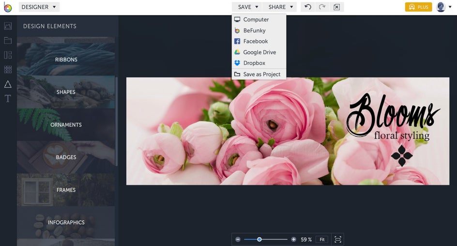
Once you’re happy with your Twitter header masterpiece, you can save it to your desktop then upload it to Twitter. If you haven’t quite finished creating your header but want to come back to it later, simply select “Save as project” and you can work on it another time. Saving your project also allows you to keep your visuals handy in case you need to use them for a promotion down the line (and want your branding to remain consistent). Alternatively, it also lets you come back to your header to fix any pesky typos or other issues - without starting from scratch!
More Tips To Enhance Your Twitter Profile
Now that your Twitter header is in great shape, it’s time to make sure the other visual assets of your profile are perfected too! Your profile photo is another important element on Twitter, so make sure you have one that ties-in effortlessly with your header. You want to present a cohesive and balanced look, so ensure that neither your profile photo or header compete with one another for attention. If your header has a lot going on in it, then pair it with a simple profile photo, and vice-versa!
The importance of visuals on Twitter also extends far beyond just your header and profile photo, as studies have shown that regularly posting tweets containing images can increase your engagement by 200%. Just think of all of those additional likes, retweets, and follows!
Creating Twitter-optimized visual content that’s unique to your brand can be tricky though, with many users not even knowing where to start. The good news is that BeFunky’s Designer also has Twitter Post templates that are fully customizable, so you can easily whip one up in under a minute. And did we mention they’re perfectly-sized? How good is that?!
Conclusion
Forget hiring a graphic designer to create a stunning header for your business or personal Twitter account. Thanks to BeFunky’s Designer, creating your own visual assets to help boost engagement on Twitter has never been easier!
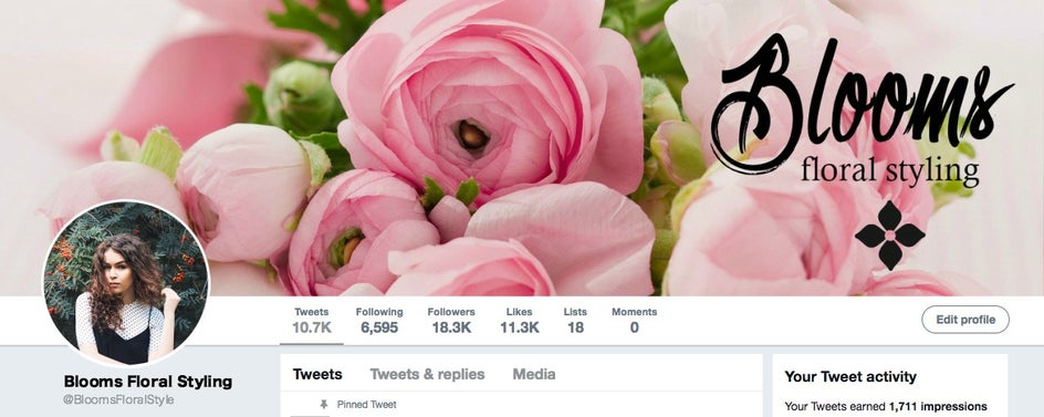
Ready to make your Twitter profile stand out from the crowd? Try the BeFunky Designer for yourself!


